2026 Paint Color Trends: The Colors Worth Actually Committing To
Paint is the commitment that feels small and isn’t. A gallon costs $65. The decision about which color to buy, and where to put it, matters far more than the cost suggests — because you’re going to look at that wall every single day, in every kind of light, in every kind of mood. Getting it wrong isn’t a disaster, but repainting is a Saturday you could have spent doing something else.
I’ve repainted more rooms than I’d like to admit. I’ve made exactly the mistakes I’m going to warn you about here. I’ve also found the combinations that work and the specific paint names that deliver what they promise on the chip.
These are the colors moving through interiors in 2026 — the ones worth paying attention to and the ones I’d approach carefully.
Soft Sage Green — The Color That Works Everywhere and Is Impossible to Get Wrong
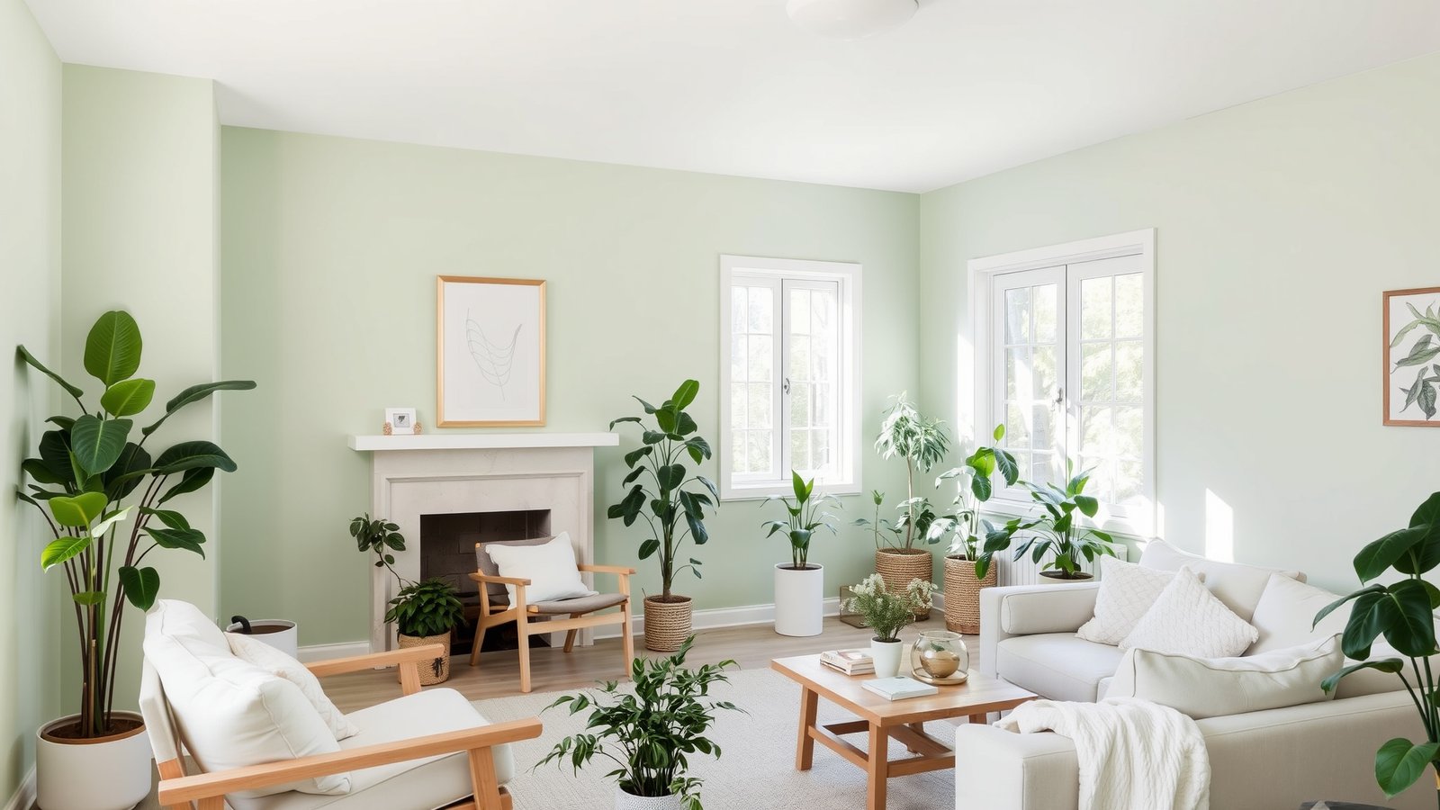
Sage green has been gaining ground for a few years and it’s not slowing down in 2026 — because it solves a problem most people have in their homes without realizing it. It’s not neutral enough to be boring, not bold enough to be a commitment, and it reads differently in every light: warmer in the morning, cooler in the afternoon, almost gray in the evening. That’s a lot of personality for one color.
The specific paints that deliver: Sherwin-Williams Privilege Green is the one I come back to most often — it has just enough gray in it to keep it sophisticated without going cold. Benjamin Moore Saybrook Sage is the warmer alternative, closer to olive than gray. Both are worth getting sample pots ($4–6) and living with on the wall for 48 hours in different lights before committing.
The undertone is everything with sage. Some sage greens pull blue in cool light and look more seafoam than sage — not a problem if you want that, a significant surprise if you don’t. Check your sample in the room’s actual light, in the evening with lamps on. That’s the version you’ll see most.
Warm Terracotta — Rich, Grounding, and Harder to Pull Off Than It Looks
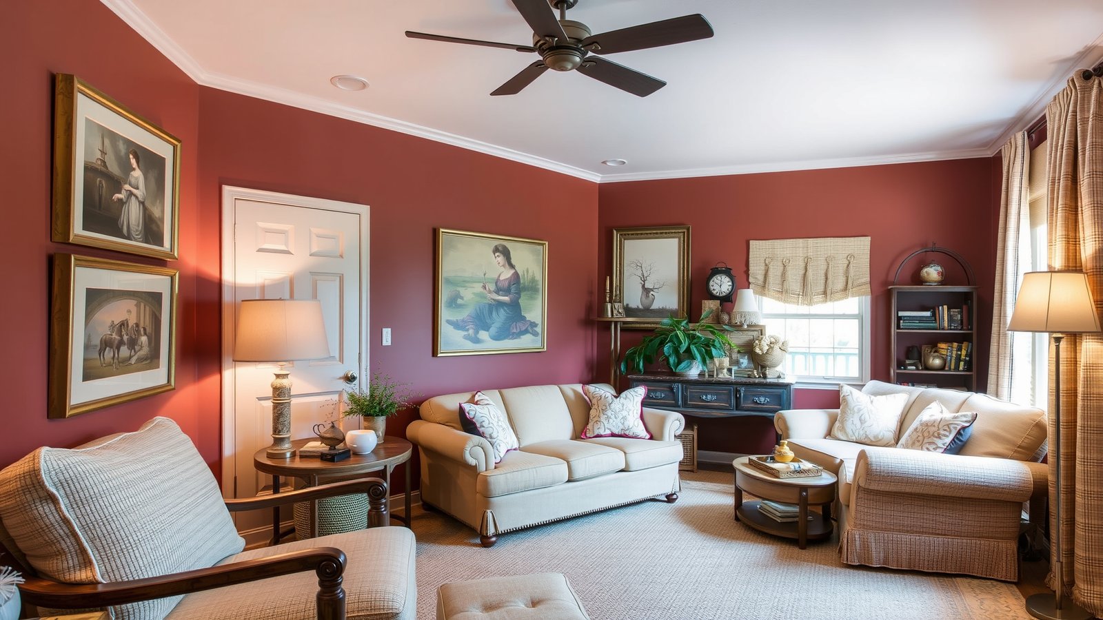
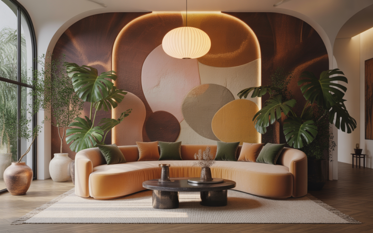
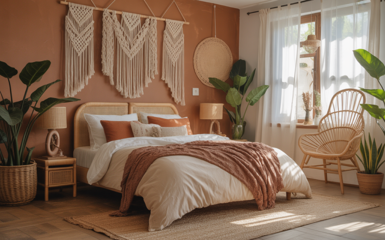
Terracotta is the color that looks effortlessly warm in every magazine photo and requires more consideration than any other color on this list to get right in a real room. The reason: terracotta has significant orange in it, and orange in artificial light can become very intense, very fast. In a room with warm incandescent light in the evening, the walls can look like the inside of a kiln.
The version that works: Sherwin-Williams Cavern Clay is the terracotta everyone’s talking about in 2026 and it earns the attention — it’s warm without being aggressive, reads like a sun-baked wall rather than an orange paint can. Benjamin Moore Pueblo is slightly deeper and richer, better for rooms that get good natural light. Both are beautiful. Both should be tested in actual evening light before committing.
I tried a full terracotta dining room once. Four walls, high ceilings, generous windows. In the afternoon it was stunning. At dinner with warm overhead lighting, the room felt like it was on fire. We repainted three walls cream and kept one as the accent. That version was the one worth keeping. One terracotta wall is almost always the right call.
Cool Charcoal — The Dark Color That Actually Works
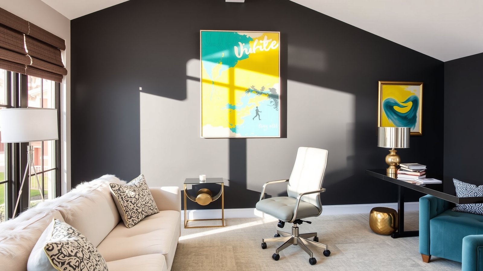
Charcoal is the dark color that works where true black is too aggressive and dark gray is too safe. It has just enough warmth or coolness (depending on the specific paint) to feel like a considered choice rather than a default.
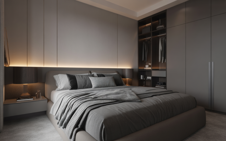
The important distinction: cool charcoal and warm charcoal look completely different on a wall. Cool charcoal — Sherwin-Williams Iron Ore, which reads almost black in low light and a beautiful deep gray in daylight — works in rooms with good natural light and contemporary styling. Warm charcoal — Benjamin Moore Wrought Iron has some brown in it — works in rooms with more traditional furniture and warmer lighting. Get both samples if you’re deciding between directions.
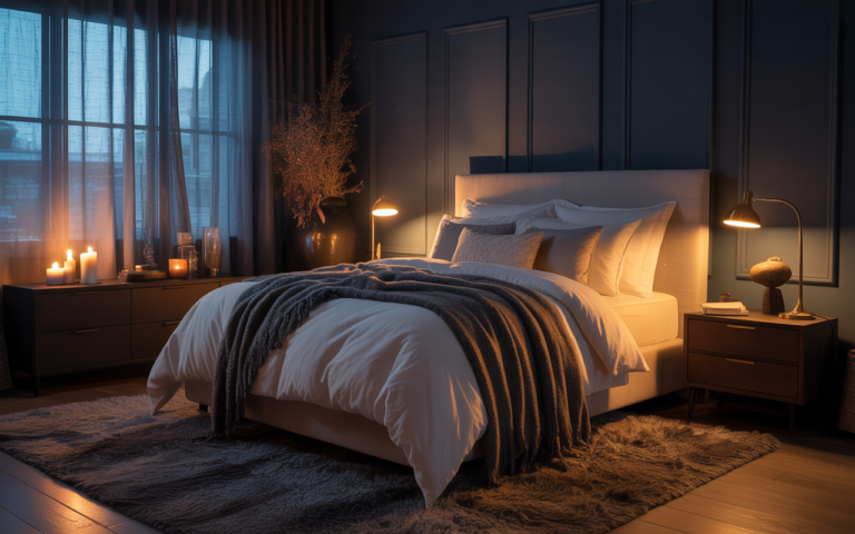
The one rule I enforce with charcoal: it goes on one wall only in any room under 200 square feet. I tried a full charcoal bedroom — all four walls — and lasted exactly three weeks before repainting. The room felt pressurized rather than cozy, and no amount of good lighting fixed it. One charcoal wall behind the bed, or behind the sofa, or as the backdrop for a home office — that’s where charcoal is extraordinary. Four charcoal walls are a different thing entirely. For more on dark accent wall approaches in bedrooms specifically, the cozy moody bedroom ideas guide covers the one-wall approach in detail.
Gentle Lavender — The Unexpected Neutral
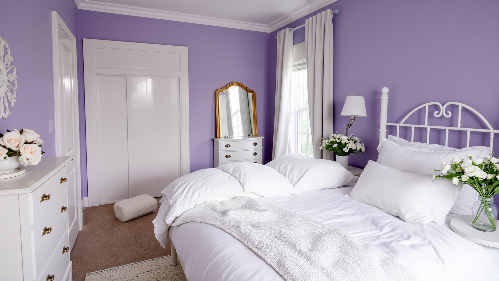
Lavender is having a genuine moment in 2026 and it’s more versatile than people expect. The reason it’s being used more broadly is that the current wave of lavender is much softer and grayer than what came before — less purple, more like a warm white with a slight violet undertone. In many lights it reads almost as a neutral.
Benjamin Moore’s Lavender Mist is the version I keep recommending — it’s soft enough to work in almost any room, different enough from white to add visible interest, and it reads beautifully in natural light. Sherwin-Williams Celandine is slightly warmer and pulls more mauve. Both work in bedrooms and bathrooms particularly well.
The pairing that consistently works: lavender walls with warm white trim (Benjamin Moore White Dove on the trim), natural wood floors or furniture, and white or cream textiles. Don’t pair lavender with cool whites — the cool white will pull the lavender toward purple and the room will lose the soft, sophisticated quality you’re going for.
Bright Coral — Commit Fully or Not at All
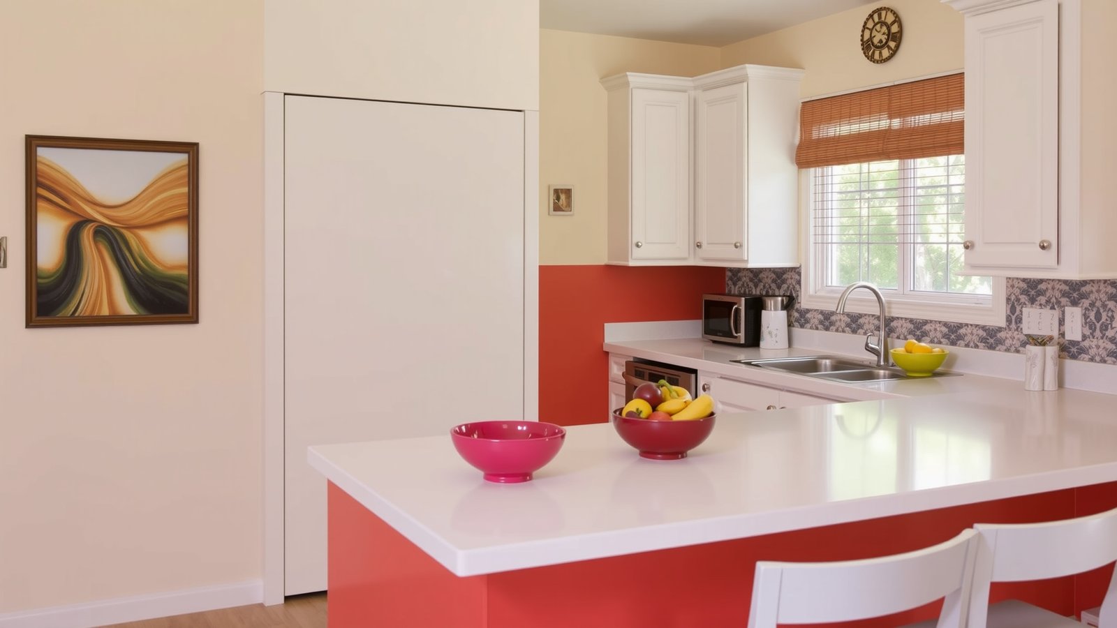
Bright coral is the high-risk, high-reward color on this list. In a kitchen, a playroom, or a creative workspace where you want the room to feel genuinely energetic — full of daylight and the specific good mood that comes from being somewhere that looks happy — coral works powerfully. In a bedroom or a living room where you need the room to wind down with you, it works against you.
If you’re trying coral for the first time: use it below a chair rail or on the lower third of the wall only, with white above and white trim. It reads bold and cheerful without the full commitment. Sherwin-Williams Coral Reef is the version with enough sophistication to work in a kitchen alongside proper cabinetry. Benjamin Moore Inca Gold has orange in it that reads warmer and slightly more complex.
A semi-gloss finish on coral in a kitchen makes practical sense (easier to clean) and the slight sheen helps the color stay vibrant rather than looking flat under artificial light.
Deep Navy — The Classic That Earns Its Reputation
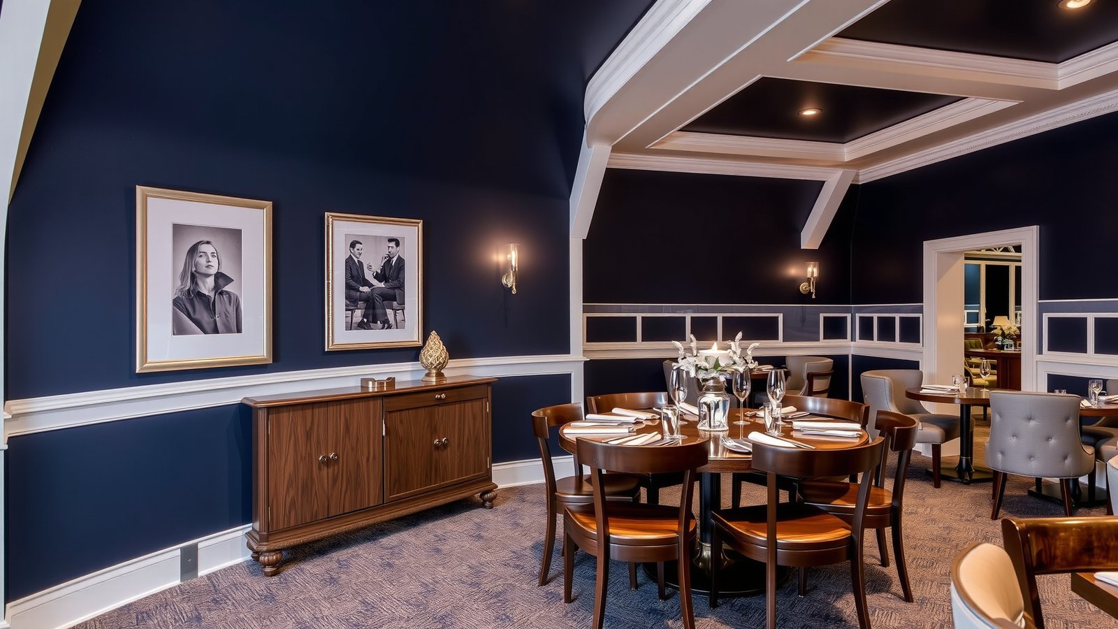
Deep navy is probably the color I’ve recommended most consistently over the past several years because it delivers reliably in almost every context it’s used. It makes a dining room feel intimate and important. It makes a home office feel serious and focused. It makes a bedroom feel like somewhere worth sleeping in.
Sherwin-Williams Naval is the navy that most designers go back to — it’s deep enough to read as genuinely dark, warm enough not to go cold or purple in artificial light. Benjamin Moore Hale Navy is the slightly more accessible version, a touch lighter and with more blue in it. Both are genuinely good choices. The main thing they have in common is warmth in their undertone, which is what keeps navy from looking like a bathroom from 2003.
White trim is not optional with deep navy — it provides the contrast that makes the navy read as rich rather than dark and tired. The trim color I use: Benjamin Moore Chantilly Lace or White Dove. Nothing cool or bright. Warm white trim makes navy look expensive. Cool white trim makes it look sharp in a way that can feel harsh.
Soft Blush Pink — Warmer Than You Think
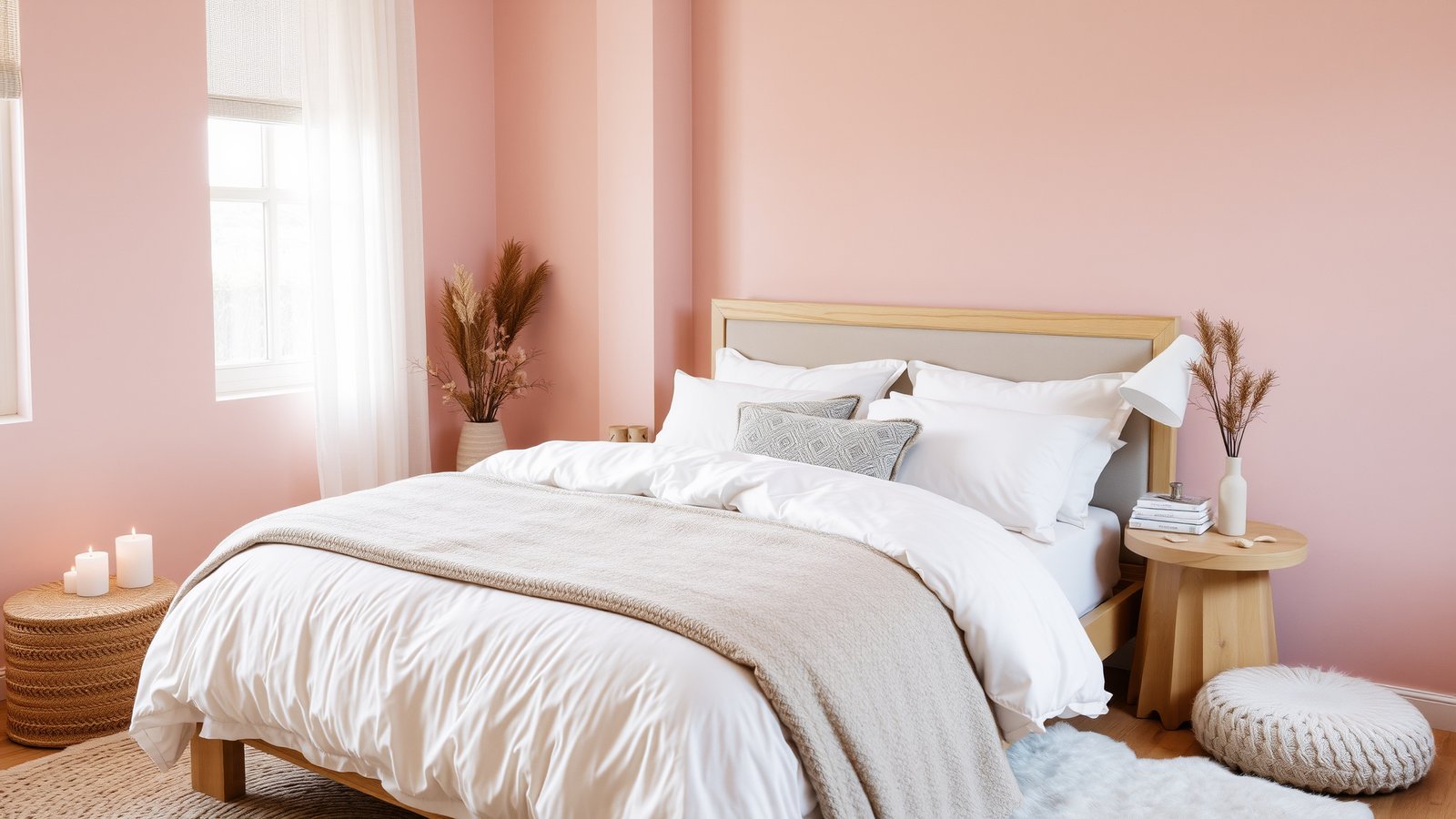
Soft blush is one of those colors that reads completely differently depending on who’s looking at it and what room it’s in. In a bedroom with warm lighting, linen bedding, and wood furniture, it reads warm and enveloping. In a room with cool overhead lighting and white everything, it reads like a color that couldn’t commit to being pink.
The version that works consistently: Benjamin Moore Pale Rose, which is soft enough to feel like a warm white in some lights and clearly pink in others. Sherwin-Williams Mellow Coral has slightly more peach in it, which reads warmer and more interesting than straight pink.
The pairing I’ve used most successfully: blush walls with warm wood furniture (not light wood, warm wood — walnut or oak with amber tones), linen or cotton bedding in oatmeal or warm white, and brass or unlacquered hardware. That combination feels genuinely sophisticated in a way that blush-on-blush-on-blush doesn’t. Natural textures are what keep blush from reading as a nursery color.
Bold Mustard Yellow — For People Who Aren’t Afraid of the Room
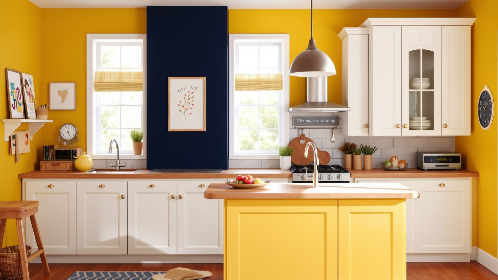
Mustard yellow is the color that divides people immediately and permanently. You either see a room painted in it and think “yes, that’s exactly right” or you see a room painted in it and think “I could never.” If you’re in the first camp, this is the 2026 moment to commit.
The mustard that works is not the yellow of 1970s appliances — it’s deeper, earthier, and has enough brown in it to feel sophisticated rather than loud. Sherwin-Williams Nugget is the version I’d start with: warm, complex, and beautiful next to dark wood furniture. Benjamin Moore Hathaway Gold is slightly more orange and works in spaces with a lot of natural light.
The pairing that makes mustard look its best: deep navy or charcoal as the accent color in the same room, natural wood throughout, and white or cream as the trim and ceiling. That combination — mustard walls, navy throw pillows or navy armchairs, wood floors, white trim — is one of the most genuinely beautiful color combinations in interior design right now. It’s confident without being aggressive.
Earthy Olive Green — The Color That Makes Everything Around It Look Better
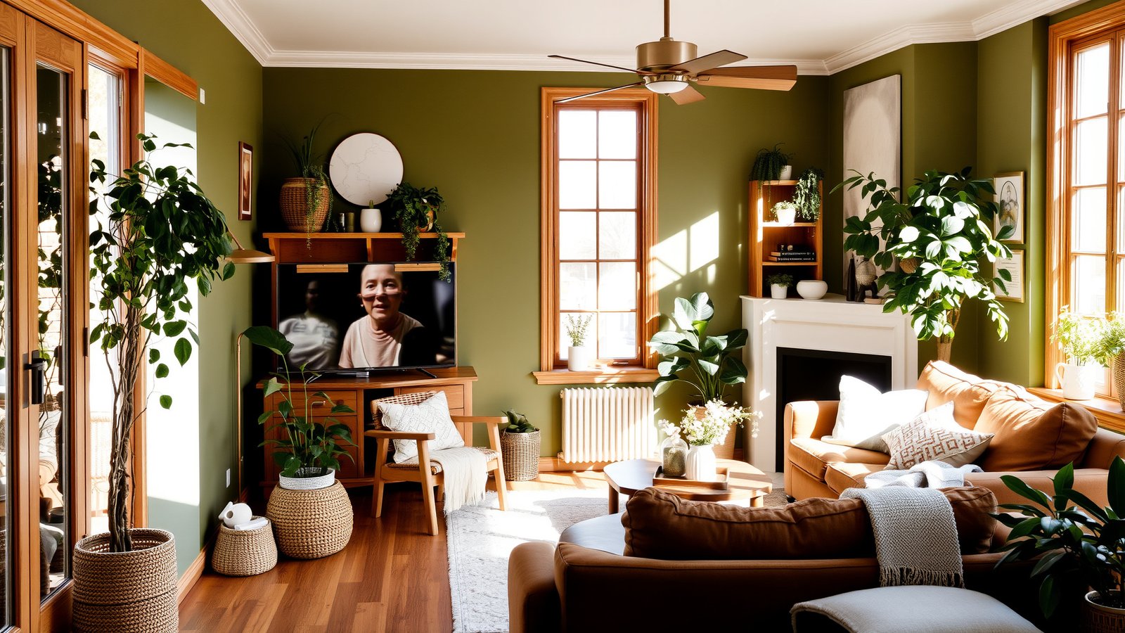
Olive green is the most complex color on this list because it shifts the most dramatically with light. In direct afternoon sun it looks almost golden. In the morning with cool north light it pulls gray. In the evening with warm lamps it looks warm and deep. That versatility is why it works so broadly and why it’s worth the sample-testing investment.
Sherwin-Williams Oakmoss is the olive I keep coming back to — it has just enough warmth to stay friendly in evening light and just enough complexity to be interesting throughout the day. Benjamin Moore Olive Branch pulls slightly more gray and works beautifully on kitchen cabinetry specifically, where it photographs incredibly well against white countertops.
The combination that’s working particularly well in 2026: olive green cabinetry with unlacquered brass hardware, white or cream countertops, and terracotta or warm clay tile on the floor or as a backsplash accent. It’s the earthy kitchen palette that feels connected to nature without looking like a cabin. For how olive green reads in a bedroom context, the earthy minimalist bedroom guide has specific examples.
Light Sand Beige — The Neutral That Actually Has a Point of View
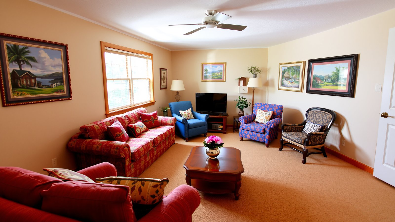
Not all beiges are the same and it’s worth being specific about this because choosing the wrong beige is the most common paint mistake in residential interiors. A beige that pulls pink becomes blush in certain lights. A beige that pulls green becomes murky. A beige that pulls gray becomes cold. The right warm sand beige stays warm, stays grounded, and makes everything you put in front of it look good.
Benjamin Moore Sand Dollar is the gold-standard warm sand — it has yellow-orange undertones that keep it warm in every light and make wood furniture look beautiful against it. Sherwin-Williams Accessible Beige is slightly warmer and slightly more golden, and it’s been one of the most popular interior neutrals for a decade for good reason. Both work. Both reward a proper sample test.
Sand beige is the right choice when you want a wall color that disappears into the background and lets your furniture and art do the work. It’s genuinely neutral in a way that white often isn’t — white walls in a room without sufficient natural light can look gray or cold, while sand beige stays warm regardless.
Rich Burgundy — The Risk Worth Taking in the Right Room
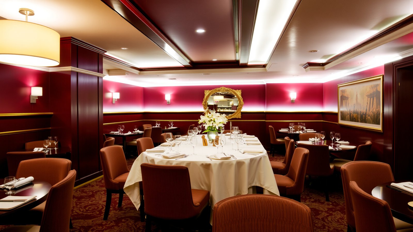
Burgundy is the color that, when it works, looks like the designer knew something everyone else didn’t. A dining room with deep burgundy walls, warm candlelight, and gold hardware is one of the most beautiful interiors available without a renovation budget. When it doesn’t work — in a small room with inadequate lighting, or in a space that needs to feel open — it can feel like being inside a very expensive storage unit.
The burgundy that works in 2026 is richer and browner than the jewel-tone burgundy of a few years ago. Sherwin-Williams Antique Red has enough brown in it to feel warm and old-world rather than loud. Benjamin Moore Baroque Rose pulls more pink and works in spaces with better natural light. Both look incredible in satin or eggshell finishes — the slight sheen in a dark color bounces the light in a way matte can’t.
One wall in a dining room. White ceiling. Warm lighting from a statement pendant and candles on the table. That’s the formula. Don’t fight the darkness of the color — lean into it with lighting and let the room be intimate.
Cool Aqua — The Bathroom Color That Feels Like Wellness
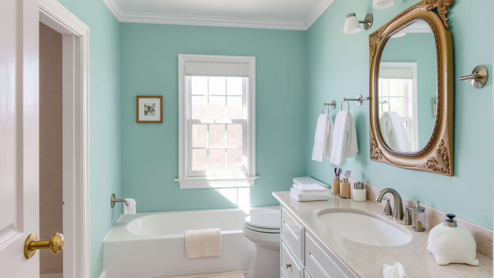
Aqua has a specific quality that no other color achieves: it makes a bathroom feel like a spa without any additional styling effort. The combination of blue and green reads as clean, refreshing, and slightly elevated — the color equivalent of a good hotel bathroom.
Sherwin-Williams Tidewater is the aqua that photographs beautifully and reads calmly in person — it’s not aggressive, it’s not trying too hard, it just makes the room feel better than it did before. Benjamin Moore Antiguan Sky is slightly more tropical and works better in rooms with abundant natural light.
The common mistake with aqua: cool-white trim. Aqua is a cool color and cool-white trim makes the combination feel clinical. Warm-white trim — Benjamin Moore White Dove, which has yellow in it — softens the contrast and makes the aqua read refreshing rather than sharp. That’s a one-gallon difference that changes the whole room.
Warm Cream — The White That Isn’t White and Is Better For It
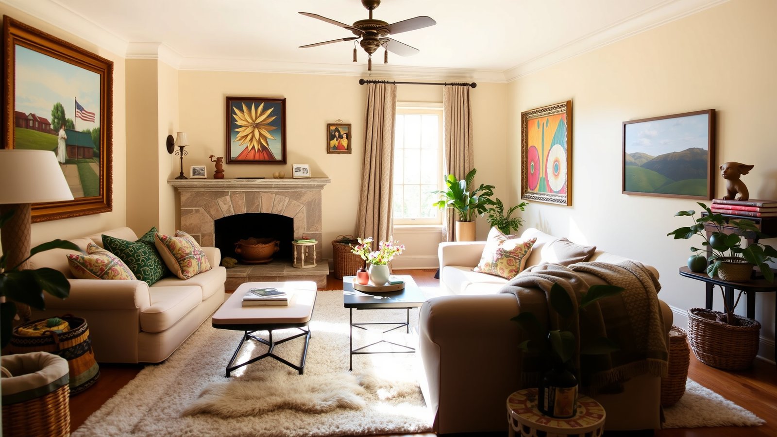
The case against plain white walls in most homes: they require exceptional natural light to look good, and most rooms don’t have exceptional natural light. In a room with imperfect light — north-facing, small windows, artificial lighting dominant in the evening — white walls look gray or flat. Warm cream looks like someone made a deliberate and beautiful choice.
Benjamin Moore White Dove is technically an off-white but functions as the perfect warm cream — it has enough yellow and warmth to glow under artificial light and it works with literally every other color in the world. Sherwin-Williams Alabaster is the closest competitor, slightly more yellow and very slightly warmer. Both are among the most widely used interior wall colors for a reason.
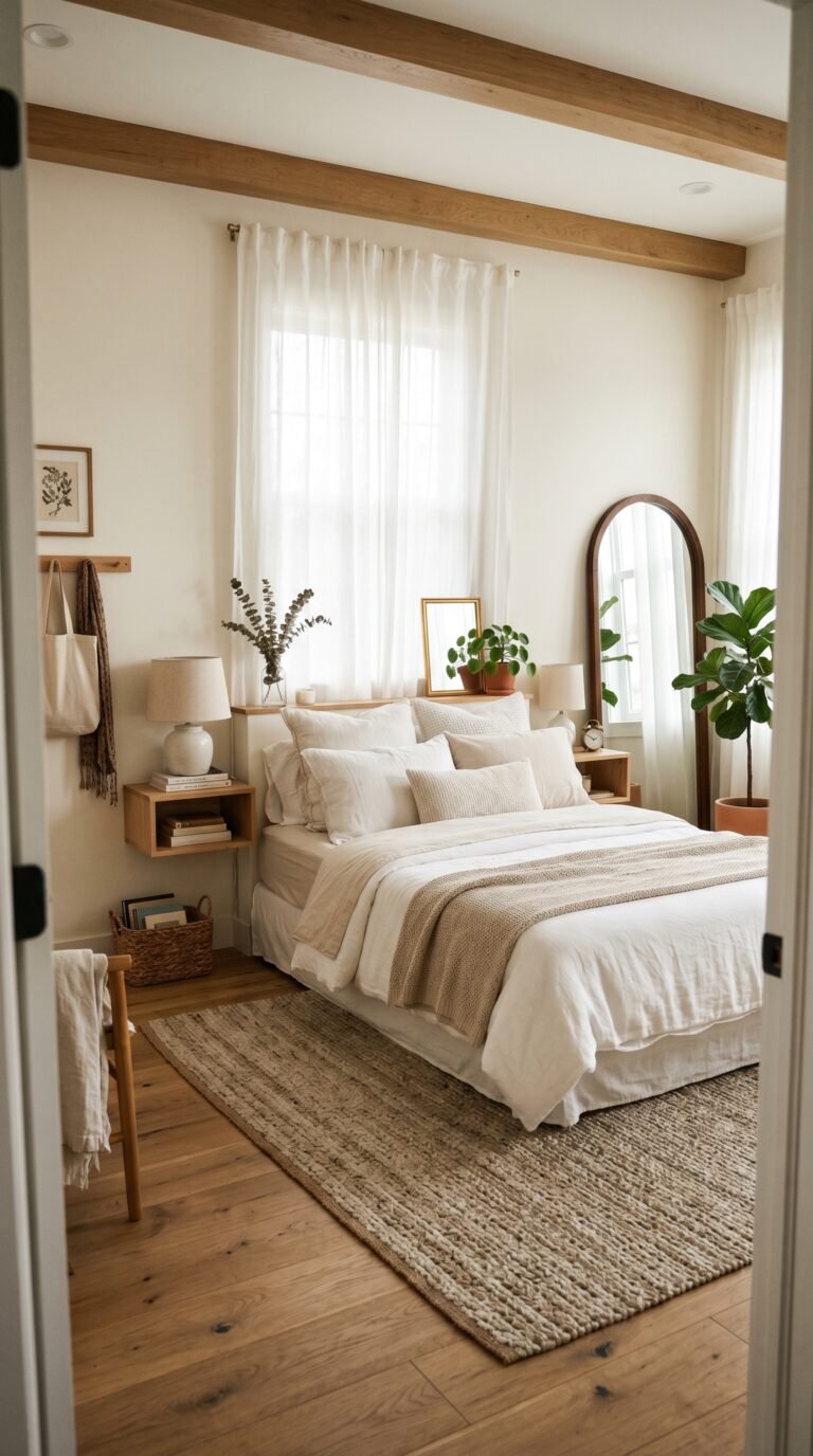
Warm cream walls with natural wood floors, white trim (same White Dove on the trim or slightly brighter), and colorful accessories — art, pillows, plants — is the most versatile and reliably beautiful interior setup available. It’s the background that makes everything in front of it look good. For how this works specifically in smaller bedrooms, the small bedroom ideas guide covers warm walls and light reflection in detail.
Bright Ocean Blue — Bold, Specific, Unforgettable
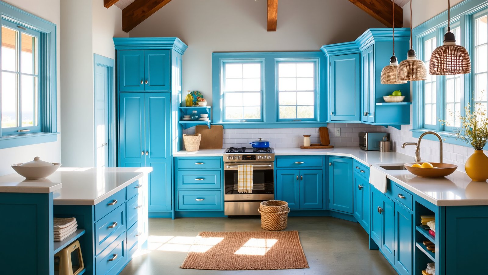
Ocean blue is the bold choice that has a clear purpose: it makes a room feel awake and energetic in the best possible way. It belongs in spaces where energy is the point — a kitchen where you cook and gather, a home office where you need to think clearly, a bathroom that should feel like a refresh every time you walk into it.
Sherwin-Williams Resolute Blue is the version that reads genuinely blue without pulling green or purple — a clean, confident color that looks beautiful against white cabinetry. Benjamin Moore Blue Danube is slightly deeper and more sophisticated, better for rooms where bold but refined is the goal.
The styling that makes ocean blue work: crisp white as the primary companion color, natural wood as the warm element, and keeping accessories simple. Ocean blue is doing enough. It doesn’t need help from a lot of competing colors or patterns.
Classic White — Not a Neutral, a Decision
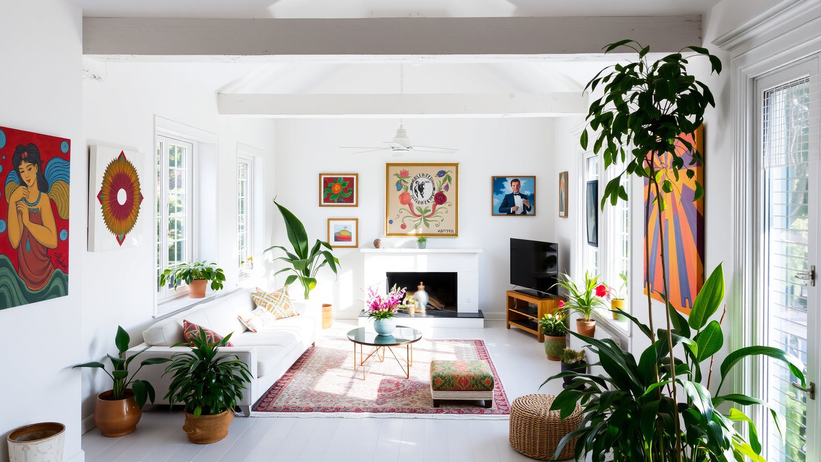
White is not neutral. This is the most important thing to know about choosing a white paint, and almost nobody tells you before you’ve already bought the wrong one. Every white has an undertone — pink, yellow, blue, green, gray — and that undertone becomes visible on the wall in your actual light, which is different from the light in the paint store.
The whites that work most reliably across different rooms and different light conditions: Benjamin Moore Chantilly Lace (crisp, bright, very slightly cool — the best white for rooms with good natural light) and Sherwin-Williams Extra White (the warmest of the bright whites, works in rooms with more artificial light). If you want something less stark: Benjamin Moore White Dove (the warm off-white that works everywhere) is technically cream but reads as white in most rooms.
The test that saves most repainting projects: buy three or four sample pots of different whites, paint 12×12 inch squares on the actual wall, and look at them at three different times of day — morning, afternoon, and evening with lamps on. The one that looks good in all three is your white.
Questions I Get Asked a Lot About 2026 Paint Colors
How do I choose between all the shades of the same color? Undertone is the decision. Two sage greens can look completely different because one pulls blue and one pulls yellow. Get sample pots — they’re $4–6 each — and paint proper-sized swatches (at least 12×12 inches) on your actual wall. Look at them in the morning, afternoon, and evening. The one that looks right in your room’s specific light at all three times is the right one.
Is it worth hiring a color consultant? For a full house repaint or a room you’re nervous about, yes — absolutely. A color consultation with a certified color consultant typically runs $150–300 and can save you the cost of a repaint in the wrong color plus the time to redo it. For a single accent wall or a room you already have a strong direction for, the sample pot approach is sufficient.
What finish should I use for each room? Matte or flat finish for ceilings and low-traffic walls — it hides imperfections and reads soft. Eggshell for most living spaces and bedrooms — it has slight sheen that’s wipeable without looking shiny. Satin for kitchens and bathrooms where cleaning is frequent. Semi-gloss for trim, doors, and cabinetry — it creates the contrast between wall and trim that makes painted rooms look properly finished.
I want to paint an accent wall but I’m scared to commit. What’s the lowest-risk way to start? Start with the wall behind your bed or sofa — it’s the wall that’s most often obscured by furniture and easiest to live with even if you have doubts. Choose a color that’s a deeper version of something already in the room (a deeper blue if you have navy pillows, a richer green if you have olive accessories) so it reads as intentional rather than random. And use the sample pot test before committing — two days living with a painted swatch tells you everything a paint chip doesn’t.
Does paint color actually change how a room feels, or is that exaggerated? It genuinely changes how a room feels, and the effect is measurable in mood and even in perceived temperature. Cool colors (blues, greens with blue undertones) make rooms feel cooler. Warm colors (terracotta, mustard, warm cream) make rooms feel warmer. Dark colors make rooms feel smaller and more intimate. Light colors make rooms feel larger and more open. These are real effects, not just decorating mythology.
The Color That Changes Everything Is Usually the One You’re Scared Of
Most people’s instinct when choosing paint is to go safer than they want to. They love the terracotta but buy the beige. They’ve been thinking about the navy for a year but end up with a pale gray. Then they live in the safe room and feel underwhelmed by it.
The colors on this list that have the most transformative effect are the ones that require the most conviction: the deep navy dining room, the charcoal home office, the terracotta accent wall you’ve been talking yourself out of. They require testing and committing and then living with your decision — and most of the time, the decision turns out to be exactly right.
Get the sample pots. Do the testing. Then commit.
My current project: the wall at the end of my hallway has been white for two years and it shouldn’t be. I’m testing three samples this weekend — Olive Branch, Cavern Clay, and Privilege Green. I’ll report back.
— Emily
Which color on this list are you most tempted by and most scared of? That’s usually the right one. Tell me in the comments.