Wall Art Painting Ideas That Actually Change How a Room Feels
A painting on your wall is not decoration. It’s a decision. Every piece of art you hang makes a statement about how you see yourself and what you want to feel in that room — and the rooms that feel most alive are almost always the ones where someone made that decision with intention rather than just filling the available space.
The most common wall art mistake isn’t choosing the wrong style or the wrong color. It’s treating the art as the last thing to think about. People buy the sofa, pick the rug, hang the curtains, and then stand back and realize the wall is still empty. So they buy the first inoffensive print they see in a home goods store and wonder why the room still doesn’t feel quite right.
Art should be one of the first decisions, not the last. It sets the emotional tone of the room before anything else does. Get it right and even modest furniture feels considered. Get it wrong and no amount of throw pillows will fix it. Here’s how to get it right.
The Bathroom — Where One Print Does Everything
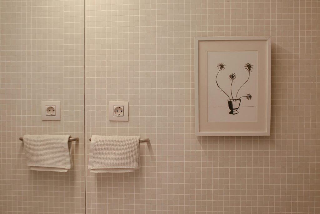
The bathroom is the room people consistently under-decorate with art and over-decorate with everything else. Soap dispensers, candles, woven baskets, collections of glass bottles — all of it trying to make the space feel considered. One small, well-chosen print does more than all of it combined.
The line drawing here is the right move for a bathroom, and specifically for this bathroom. The beige mosaic tile has texture and warmth already. What it needed was a single graphic element — something with a clear outline and plenty of white space that would read as deliberate against the busy tile background. The simple black line drawing of a potted plant in a white mat and white frame does exactly that. Nothing else on the wall. Nothing competing with it.
The rule for bathroom art is restraint. One piece, not a gallery wall. A frame that matches or relates to the hardware finish in the room — here, the wooden towel rails and the white frame are in quiet conversation. And a subject that connects to nature or creates a quiet moment of poetry. Art in the bathroom should feel like a small reward for walking in.
For bathrooms with a lot of visual noise — patterned tile, colored grout, decorative hardware — a simple line drawing in black and white, matted with at least two inches of white space, runs $20–$80 as a digital print from Etsy. Frame it in white or natural wood and hang it at eye level from the floor rather than centered on the wall. It will look better than anything larger would. For more on styling small rooms with restraint, the bathroom decor ideas approach applies the same logic across every surface.
Mixing Formal and Casual on the Same Wall
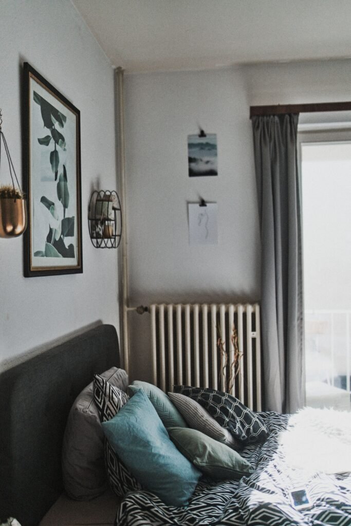
The instinct most people have when decorating a bedroom wall is to pick a lane — either everything framed and hung formally, or everything casual and relaxed. The rooms that feel most alive usually do both at once, and the bedroom is where this combination works best.
The large botanical print here — dark green tropical leaves on a white ground, in a frame with a dark finish and visible gold undertone — is a proper, formal piece of art. It’s matted, it’s substantial, and it’s hung with intention at the right height relative to the headboard. That piece alone would be a complete bedroom wall treatment. But the two small photos clipped directly to the wall near the window shift the register entirely. They read as personal, spontaneous, evolving — the kind of thing you add without committing to.
This combination works because the formal piece anchors the wall with visual weight while the casual clips signal that this is someone’s actual bedroom, not a showroom. The clips can change seasonally, or whenever you find an image that means something. They cost nothing to update. The botanical print stays.
If you’re working on a cozy moody bedroom and want more personality than a single framed print but aren’t ready for a full gallery wall, this is the middle path: one statement piece, formally hung, plus two or three unframed images on small clips or washi tape that you actually like. It’s the difference between a bedroom that looks styled and a bedroom that feels like yours.
The Easel Alternative — When Art Leans Instead of Hangs
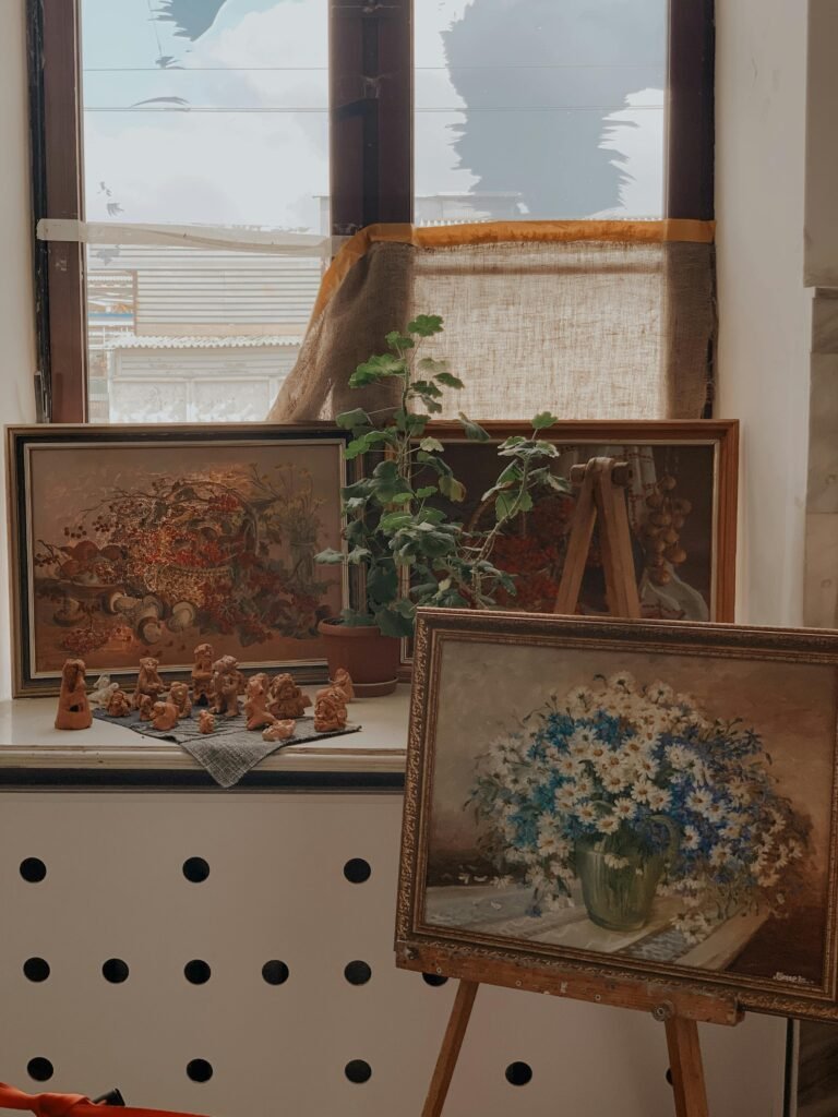
Not every painting needs to go on the wall. The easel is the most underused display option in home decorating, and it does something a hung piece can’t: it makes the art feel temporary, acquirable, in process — more like something you’re living with than something you’ve committed to forever.
Vintage oil paintings specifically are better on easels than on walls in most cases. The ornate frames on paintings like these — heavy carved wood, worn gold finish — tend to look stiff when hung directly. They need breathing room and a slight sense of occasion that the easel provides. On an easel, a vintage still life reads like a collector’s find on display rather than a painting that never got properly rehung.
The daisy painting here on a tabletop easel costs roughly $30–$150 at any antique market, flea market, or estate sale. A wooden display easel runs $25–$80. The combination — imperfect vintage oil painting on a simple easel, sitting on a windowsill or sideboard — is genuinely beautiful and costs about the same as a mediocre framed print from a big box store.
What the easel also does is make rotating art easy. You can swap the painting with the seasons, with your mood, with whatever you happen to find. The wall stays available for something more permanent. The easel keeps moving. This is the approach for people who love art but don’t want to live with the same piece in the same spot forever.
The Diptych — Why Two Paintings Outperform One
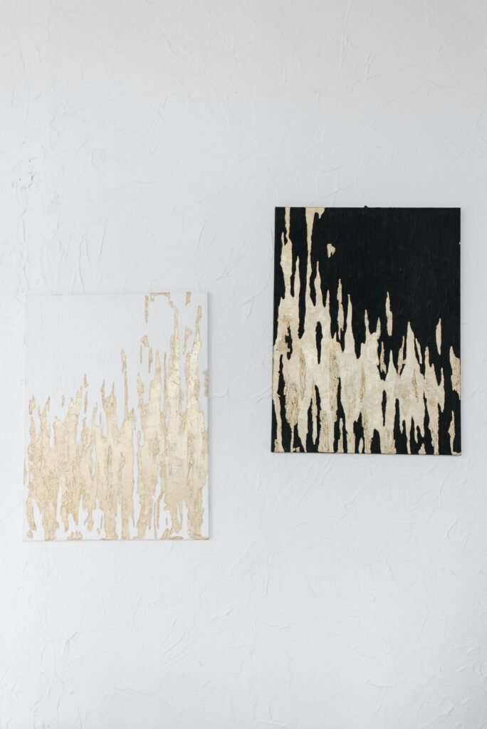
A single abstract painting is a statement. Two paintings hung together as a deliberate pair — a diptych — are a conversation, and the conversation is almost always more interesting than a monologue.
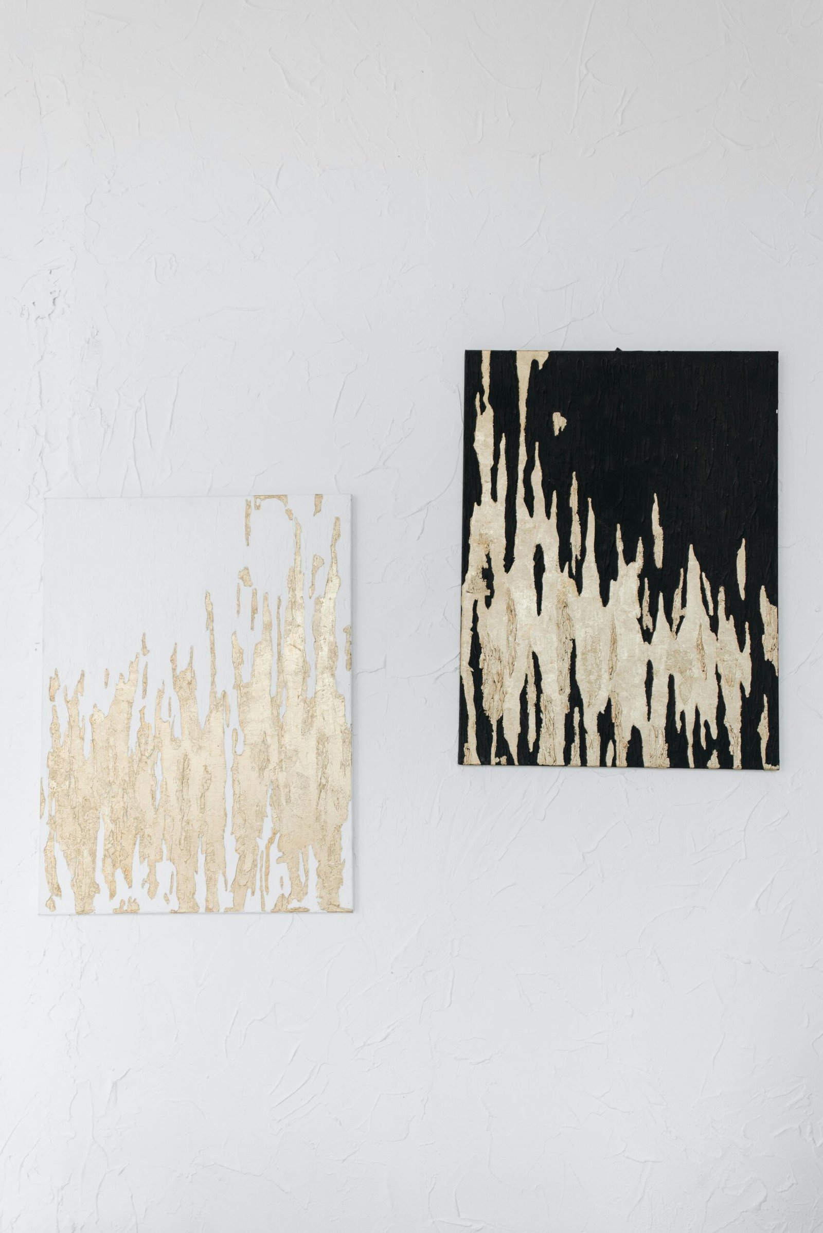
These two gold-leaf textured canvases are a perfect example of how a diptych operates. Both use the same technique: metallic gold leaf applied in vertical, dripping forms over a painted background. One background is white, one is black. The shared technique and the inverted backgrounds create an obvious relationship between the pieces that makes the pairing feel intentional rather than coincidental. Hung side by side at the same height with a consistent gap of roughly one to two inches, they read as one composite work.
The gold leaf effect here is achievable as a DIY project for under $100. Stretched canvas ($10–$20 each for a 16×20 inch), black gesso for the dark ground, white gesso for the light ground, and gold leaf sheets ($8–$15 for a pack of 25 sheets) applied in irregular vertical patterns with adhesive size. The raised texture comes from applying the leaf over rough brushwork before the size dries. Neither piece needs to be perfect — the imperfections are the point.
For rooms with a consistent neutral palette — white walls, cream furniture, warm greys — a diptych like this in black and gold is one of the strongest wall art moves available. It gives the wall something with real visual weight and complexity without introducing color that could compete with what’s already in the room. If you’re thinking about 2026 home decor trends, textured and mixed-media art in monochromatic palettes is exactly where things are moving.
Art Above the Fireplace — The Lean Versus the Hang
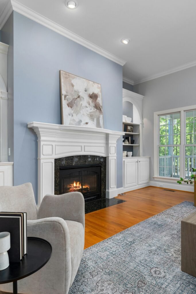
Hanging art above a fireplace is the expected move. Leaning it is the better one, and almost nobody does it.
The canvas here is large — a 36×36 inch square minimum — and it’s resting on the mantel shelf rather than mounted to the wall. It leans back slightly, the way a painting would rest in a gallery or a studio. This casual stance softens the formality of an ornate white fireplace surround in a room with tall ceilings and classic architecture. A hung painting in the same position would look correct. The leaned painting looks relaxed and considered at the same time.
The abstract itself is in the right palette for this wall. The blue-grey paint on the wall is cool; the painting responds with warm neutrals — cream, taupe, a blush that almost reads as white in the light — so the two elements contrast in temperature without clashing in tone. This is how you choose art for a colored wall: find the temperature opposite. Cool wall, warm painting. Warm wall, cool painting. The contrast creates energy; the tonal similarity keeps the peace.
The practical case for leaning: you can change it without patching walls, you can adjust the height instantly, and if the mantle already has decorative detail like this one, the leaned canvas keeps the surround visible rather than obscuring it. For more on how mantle decor works as a composition, and the full rustic mantel decorating ideas conversation, that relationship between art and mantel surface deserves its own attention.
When the Painting Sets the Room’s Color Story
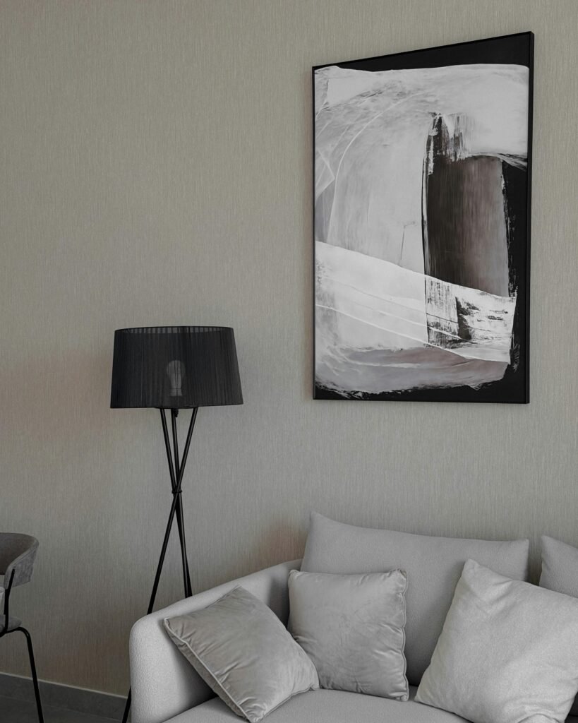
Most people choose art to match the room they already have. The more interesting approach is to choose art first and let it set the room’s direction — and a large abstract painting in a strong palette does this better than anything.
This black and white abstract canvas is not softened by the room around it. It has full, gesturally applied black brushstrokes and areas of deep grey against raw white canvas, in a black float frame that extends the drama to the wall. And the room responds. The sofa is cream boucle — the closest neutral to white available in fabric. The floor lamp is black with a black shade. The wallpaper is a warm grey linen texture. Every element in the room was chosen to relate to the two tones in the painting.
This is the right way to use a large statement abstract: hang it first, then choose the furniture in relationship to it. The painting has three values — near-white, mid-grey, near-black — so any combination of those three values in furniture and textiles will work. What won’t work is introducing a third color that the painting doesn’t contain. The painting has committed to its palette; the room needs to commit with it.
A canvas this size — vertical, roughly 40×55 inches — from an independent artist on Etsy or Saatchi Art runs $200–$800 for an original. A quality print on canvas runs $80–$250. The black float frame adds another $60–$150. For a living room TV wall or a sofa wall that needs a true focal point, a single piece at this scale and confidence does more than a gallery wall of smaller pieces ever could.
The Hallway Gallery — The Wall Nobody Thinks About
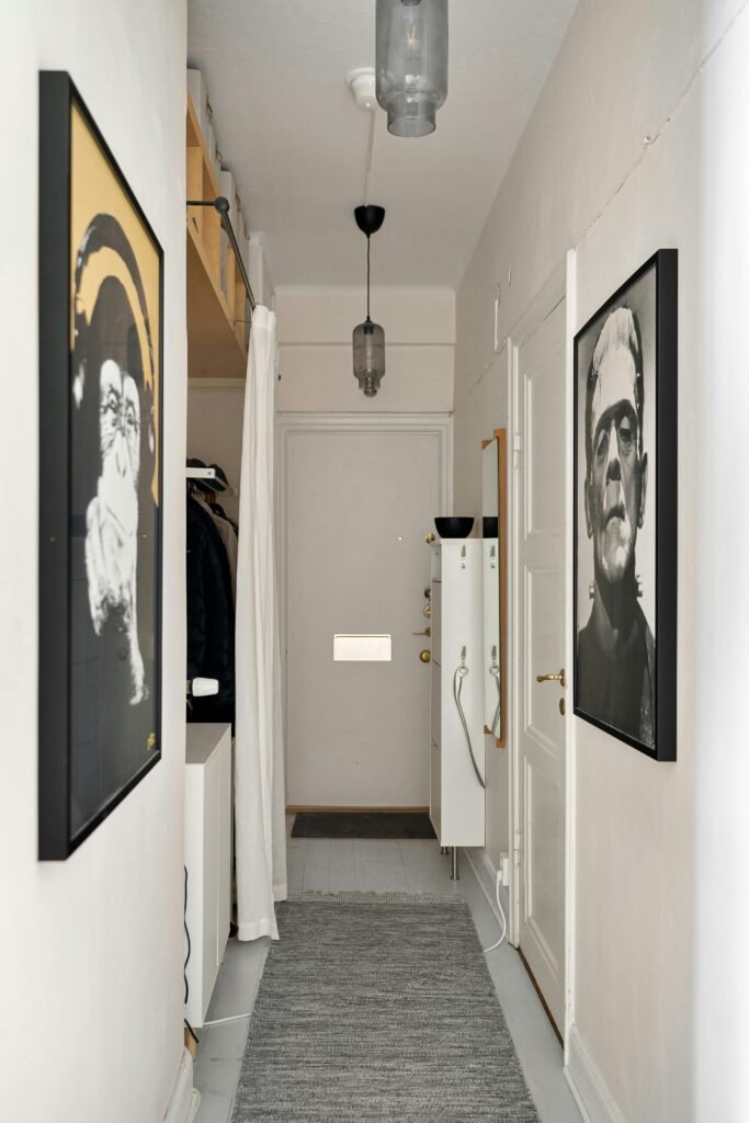
The hallway is the most underused wall in any home. People walk through it twenty times a day and hang nothing on it, or hang a small mirror and call it done. The hallway that has the confidence to put real art on its walls — large art, surprising art, art that stops you for a second — is a hallway that makes the whole home feel more alive the moment you walk in.
These two oversize portraits are doing exactly that. A pop-art dog in yellow and black on one wall; a stark black and white close-up face on the other. Both are large — at least 24×30 inches — in matching black frames that create cohesion between two very different images. The narrow hallway means you experience them up close, which works in their favor. A small print in a narrow hallway disappears. A large portrait in a narrow hallway is impossible to ignore.
The counterintuitive thing about art in hallways: the narrower the space, the larger the art should be. In a hallway, there’s nowhere to step back and see a small piece from a distance. Everything is experienced up close. Large-scale photography prints and bold graphic art are the strongest choices — they hold up to close inspection in a way that detailed painterly work often doesn’t.
Printing large-format photographs or graphic prints through Artifact Uprising, Printful, or Costco Photo Center runs $30–$80 for sizes up to 24×36 inches. Black frames at this scale from IKEA’s LOMVIKEN run $20–$40. The total cost for a pair of statement hallway prints: under $200. For more on making the entry feel intentional before you even reach the living room, entryway decor ideas covers the full picture.
The Unframed Wall — Art Without a Frame
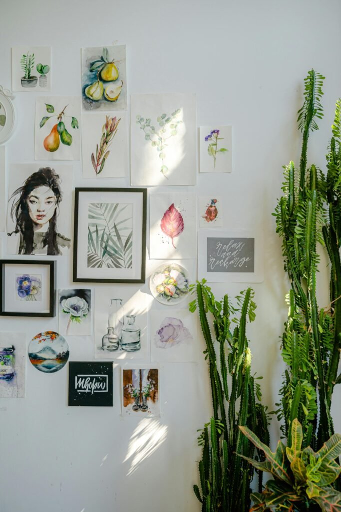
The frame is not mandatory. It is the most widely assumed requirement in wall art, and it is worth questioning.
A collection of unframed prints, sketches, and small paintings pinned or taped directly to the wall creates a visual texture that no amount of framing can replicate — it looks like a living document, an ongoing collection, an artist’s studio wall rather than a curated showroom. The watercolors here are a mix of botanical studies, fruit paintings, a portrait, a landscape, typography, a small framed piece at the center for visual anchor. They vary in size, shape, and subject. What holds them together is not matching frames — there are almost none — but a shared palette of soft, painterly colors: sage green, dusty pink, warm ivory, muted blue.
The mechanics are simple: washi tape (gentle on walls, leaves almost no residue) or small brad nails for heavier pieces. Arrange on the floor first, then transfer to the wall starting from the center. Leave slight unevenness in the spacing — too-perfect spacing makes a pinned wall look like a mock-up rather than something someone actually lives with.
The cost of this kind of wall is almost nothing if you print your own. Watercolor art prints are available through Etsy shops at $3–$15 each for digital download files you print at home or at a local print shop. A collection of 20 pieces printed at A4 or A5 size, pinned directly to the wall: under $60.
Textile Art — The Alternative to Painting
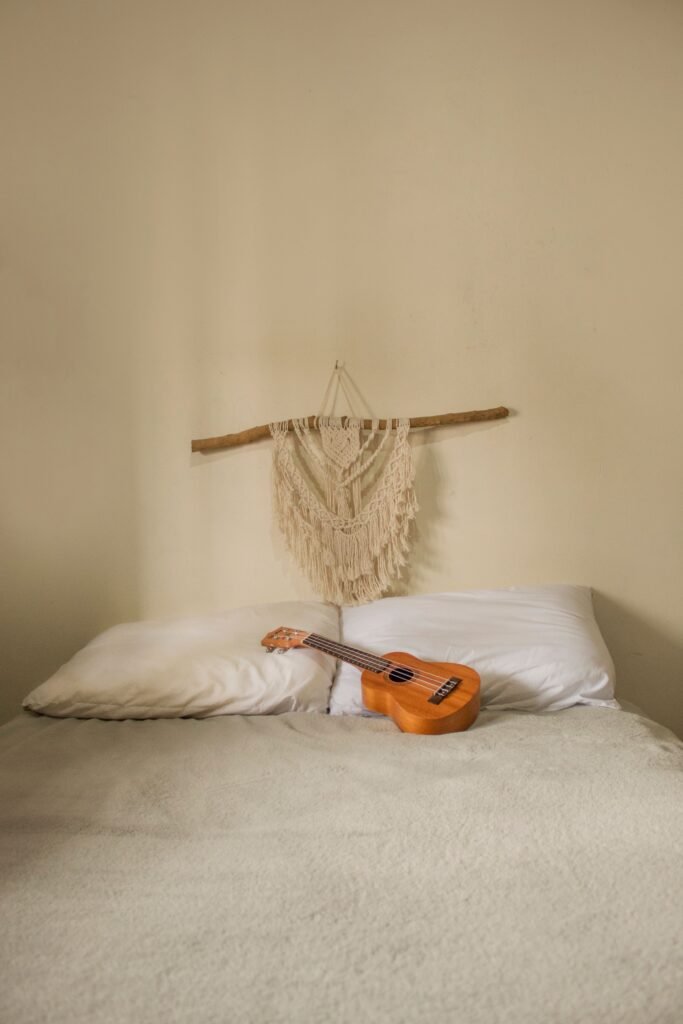
Not every wall art decision requires a painting. Textile art — macramé, woven wall hangings, embroidery hoops, fabric panels — operates in the same visual space as a canvas but with a completely different physical presence. It has depth. It moves slightly in a draft. It catches light differently from different angles. It is tactile in a way that no flat print can be.
The macramé piece here is spare and quiet — a small hanging, maybe 18 inches wide, in natural cotton rope with a simple diamond pattern and fringe, suspended from a driftwood branch. The cream-on-cream against the warm beige wall reads as almost a tone-on-tone effect: you see the texture before you see the object. This is the right scale and color for a bedroom where the goal is calm rather than statement.
Macramé as bedroom wall art works best when it replaces rather than supplements a painting. One macramé piece above the bed, full stop. Adding paintings alongside it gets competitive and noisy. Its material quality — soft, natural, handmade — is the thing that makes it work, and that quality disappears when it’s surrounded by harder-edged framed work.
Ready-made macramé wall hangings at this scale run $35–$120 on Etsy depending on complexity. A basic macramé kit with cord, instructions, and a dowel runs $20–$40 and produces something at this level of simplicity in an afternoon. For a boho bedroom specifically, this is more authentic to the aesthetic than a printed boho-style canvas — the material is the message.
The Figurative Statement — A Face Above the Bed
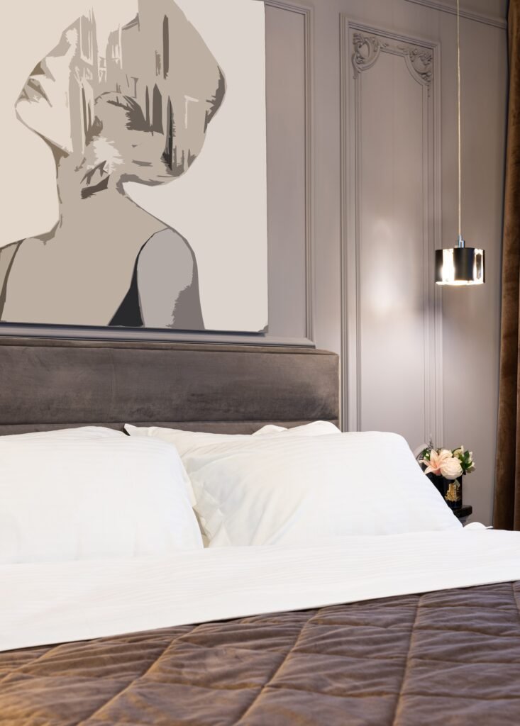
Figurative art — paintings and prints that depict a human form — above the bed is a committed choice, and that commitment is exactly what makes it work when it’s done right.
The piece here is large, roughly 40×50 inches, in a vector or pop-art style that stylizes the female form into graphic planes of warm grey, cream, and taupe. It reads as sophisticated rather than literal — close enough to figurative to be recognizable, abstracted enough to be art rather than portrait. Hung above a dark grey velvet headboard in a room with ornate grey wall molding, the painting works because of the palette alignment: the warm tones in the canvas, the cool grey of the headboard and molding, and the chrome finish of the pendant light all resolve into a coherent whole.
The practical consideration for figurative art above a bed: scale. The painting needs to be close to the width of the headboard — within 70–100% of the headboard’s width — or it will look undersized and unanchored. A piece that’s significantly narrower than the headboard makes the wall above feel unresolved. A piece that’s wider can work if the wall is wide enough to accommodate it.
Figurative prints at this resolution and scale — high-quality Giclée prints from digital originals — run $80–$300 from Society6, Desenio, or directly from artists’ shops. For a bedroom that currently feels like it’s missing a central idea, a strong figurative piece above the headboard provides one instantly. For more on building a bedroom around a single organizing idea, the earthy minimalist bedroom approach takes this principle in a quieter direction.
The Color-Forward Gallery Wall — How to Mix Without Clashing
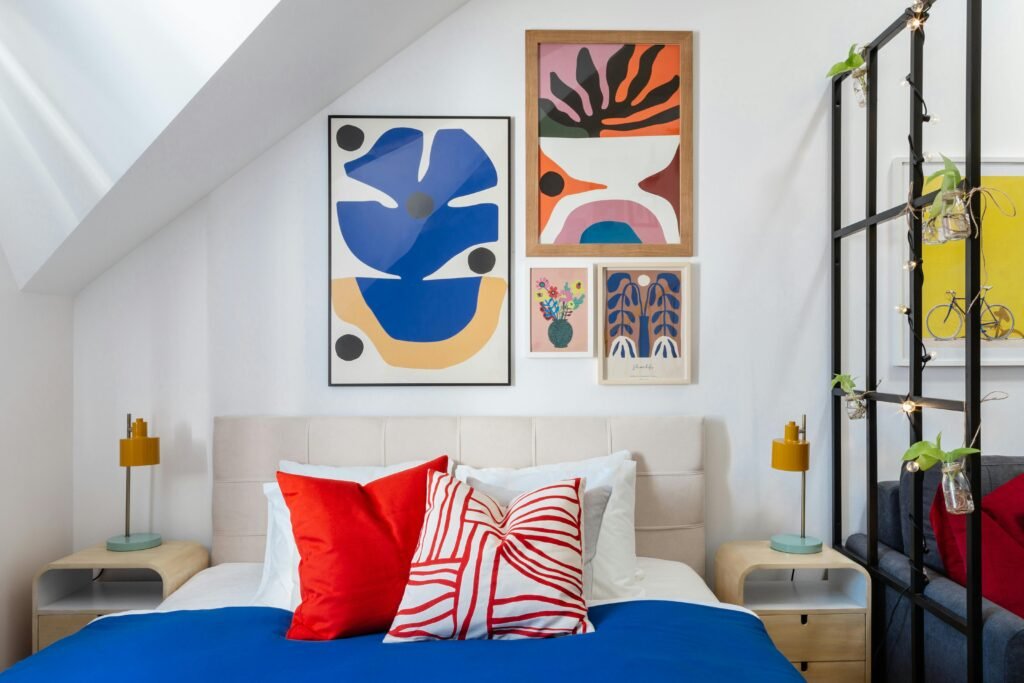
A gallery wall with multiple colors only works when there’s a logic that the eye can follow — and the logic is almost never “everything matches.” It’s usually “everything relates through a shared palette, even if individual pieces differ wildly.”
The three-print cluster here looks chaotic at first glance: cobalt blue abstract, orange and pink pop art, small green botanical. But every color in these prints appears at least once in the room’s textiles — the cobalt of the abstract picks up the blue duvet, the orange in the pop art picks up the warm nightstand, the red appears in the throw pillows. The prints are not decorating the room; they’re concentrating and amplifying the room’s colors in one place. That’s why it works.
The cluster arrangement — two prints stacked on the right, one large print to the left — is asymmetric in a way that feels dynamic rather than chaotic. The key to a cluster like this is treating the group as one composite shape. That shape should be roughly proportional to the wall space it occupies. Lay the prints on the floor first and treat the outer edges of the group as the boundary. Get the boundary right, then worry about the internal arrangement.
Digital art prints from Desenio, Society6, or independent Etsy artists run $5–$30 each as downloads you print locally. Three prints at A3 size from a print shop: roughly $20–$40 total. Three frames: $15–$40 each. The total investment for a color-forward gallery wall: $80–$170. The effect: a bedroom that has a clear, confident point of view.
The Large Moody Painting — Scale and Tone in the Living Room
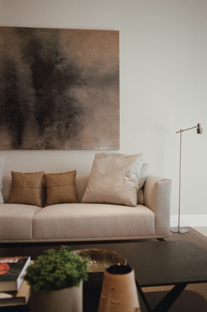
A large painting in a quiet palette is the single most powerful wall art move available to a living room, and it is almost always underestimated by people who think they need color to make an impact.
This canvas is enormous — a horizontal format that looks to be at least 48×60 inches — in a palette of warm dark browns, smoky khaki, and charcoal grey that evokes fog, depth, and landscape without depicting any of them literally. It is abstract in the way that a moody sky is abstract: recognizable in feeling, undefined in subject. Hung low above a cream sofa, its lower edge roughly 8–10 inches above the sofa back, it sits in the visual field rather than floating above it.
The palette relationship between the painting and the room is doing significant work. The cream sofa responds to the warm near-white passages in the canvas. The tan leather cushions pick up the mid-brown tones. The dark coffee table anchors the near-black in the painting’s deepest passages. Everything in the room is already in the painting — and that’s not coincidence. It’s what happens when a large painting with a complex palette is chosen first and the furniture chosen to respond to it.
Original paintings at this scale from independent artists on Saatchi Art or Etsy run $400–$2,500. Look for work where the surface has visible texture and the tonal relationships hold together when viewed small, as a thumbnail on a phone screen. Paintings with depth and variation in tone read as larger and more atmospheric than they actually are — which is exactly the quality a living room wall needs. For the same calming effect applied to a workspace, home office ideas explores how a single strong painting changes the character of a room you spend hours in.
The Art Decision Is Not the Last One
Every room in this article got better the moment someone decided what art was for rather than what art matched. The bathroom print makes the space feel personal. The diptych gives the wall something to say. The leaned canvas above the mantel relaxes a formal room. The figurative painting above the bed tells you what kind of bedroom this is before you notice anything else.
Art on a wall is not filling a gap. It’s making a claim about what the room is for and who lives in it. The rooms that feel most like someone actually lives in them are always the ones where that claim has been made — even if the art is a $12 print in an IKEA frame. The object matters less than the intention behind it.
Start with the wall you look at most. Decide how you want to feel when you look at it. Then find the piece — painting, print, textile, photograph, or something leaning on an easel — that produces that feeling. That’s the whole process.
What’s on your walls right now — and what do you wish was there instead? Tell me in the comments. I love knowing where people start.
— Emily
Common Questions About Wall Art Painting
How do I choose the right size painting for my wall? The most common mistake is going too small. For art above a sofa, the painting or gallery wall should span 60–75% of the sofa’s width — at minimum. Art above a bed should be within 70–100% of the headboard’s width. When in doubt, cut a piece of kraft paper to the proposed dimensions and tape it to the wall for 24 hours before committing. It almost always confirms you need to go bigger.
Is it better to hang one large painting or create a gallery wall? One large painting is almost always the stronger design choice — it has more visual impact and reads as more considered. A gallery wall is the right answer when you have multiple pieces you love and want to display together, or when you can’t afford one large piece and several smaller ones work together to create the same visual mass. Gallery walls are not a substitute for a large piece when a large piece is what the wall actually needs.
What’s the right hanging height for wall art? The center of the painting should sit at roughly 57–60 inches from the floor — eye level for most adults standing. This is lower than most people’s instinct. Art hung too high is the most common installation error. The exception: art above furniture. Above a sofa or bed, hang the piece 8–10 inches above the furniture’s back edge, regardless of the standard height rule.
Can I use prints instead of original paintings? Absolutely, and the quality of printed reproductions has improved dramatically. High-resolution Giclée prints on archival paper or canvas are visually indistinguishable from originals at a distance. The key is print resolution (300 DPI minimum), paper quality (cotton rag or heavy coated stock), and frame quality — a cheap frame will undermine even an expensive print.
What kind of art works in a bathroom? Bathrooms do best with one piece rather than a gallery wall. Subject matter: botanical prints, simple line drawings, minimal abstracts, or quiet landscape photography. Avoid anything that requires emotional engagement since bathrooms are transitional spaces. Frame with a sealed frame to protect against humidity.
How do I hang a gallery wall without making a mess of nail holes? Arrange all the pieces on the floor first, photograph the arrangement, then create kraft paper templates cut to each frame’s size. Tape the templates to the wall temporarily and only nail when the arrangement looks right. For a single piece, measure twice: mark the wall where the top of the frame will sit, subtract the distance from the top of the frame to the hanging hardware, and that’s your nail placement.