Kitchen Layout Ideas: The Decision That Determines Everything Else
When we renovated our kitchen, the designer said something I’ve repeated probably a hundred times since: “You can change your cabinets and your countertops and your backsplash on a Tuesday. You can’t easily change where the sink is.” She was making the point that layout decisions are structural, and structural decisions last as long as the house does — or as long as you’re willing to spend $30,000 to undo one.
Most kitchen advice skips past this. It gets straight to the hardware finishes and the backsplash tile and the cabinet color, which are genuinely enjoyable decisions. But they’re all secondary to the layout question, which determines how the kitchen feels to cook in, how it relates to the rest of the house, how many people can be in it simultaneously without getting in each other’s way, and whether the refrigerator and the stove and the sink form a triangle that makes sense or one that makes you walk unnecessary laps every time you cook.
Here is every layout type worth understanding — what it gives you, what it costs you, and the specific details that make each one work.
The Large Island Kitchen — When Scale Becomes a Statement
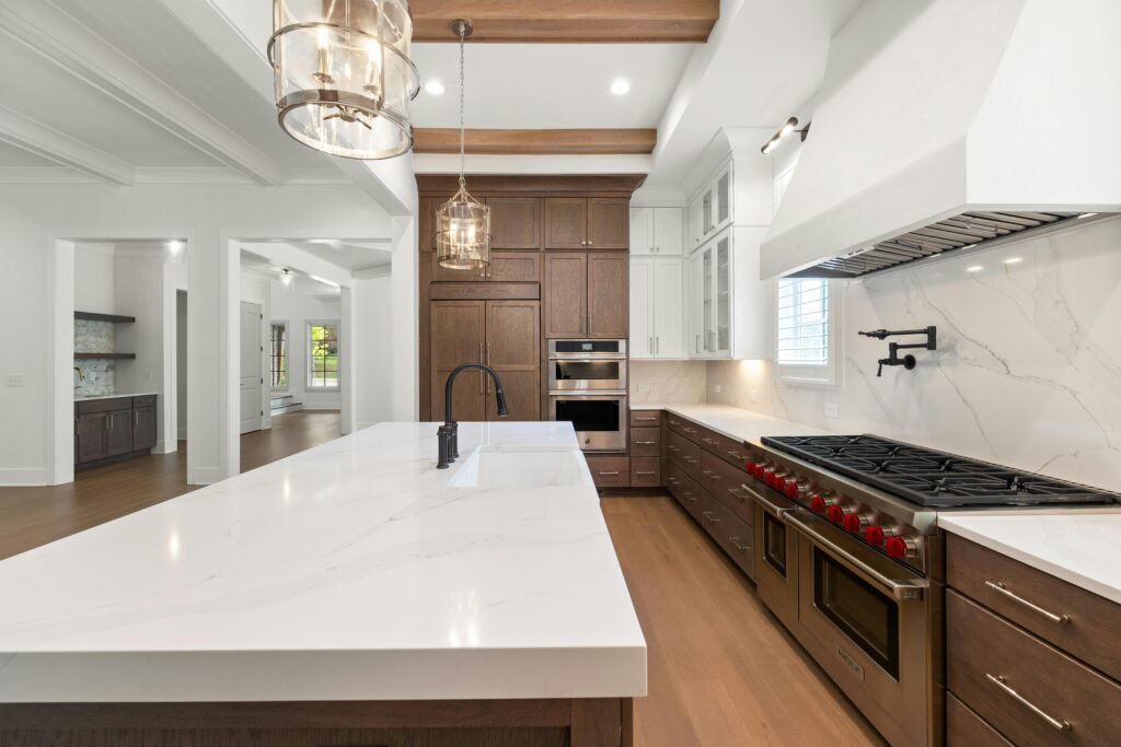
This is the kitchen that most people are imagining when they say they want a kitchen renovation. A large central island — this one in white quartz with dramatic veining, substantial enough to have its own sink and still leave prep space on either side. Dark walnut perimeter cabinets grounding the room while white uppers keep it from feeling heavy. A professional range with a pot filler on the wall because someone decided they were going to cook seriously in this room. Two glass chandeliers at exactly the right scale for the ceiling height.
It’s a beautiful kitchen. It’s also an honest example of what a kitchen at this level actually requires — and it requires a lot. An island of this size needs at minimum four feet of clearance on all sides for comfortable movement; ideally more when two people are cooking simultaneously. The island here is probably eight feet long and four feet wide, which means the kitchen overall is approaching 200 square feet of floor space. The professional Wolf range alone ($5,000–15,000 depending on the model and size) represents more than most kitchen renovations cost in total.
What this layout gets right beyond the visual impact: the zoning. The island handles prep and secondary sink work; the perimeter handles cooking, storage, and the primary workflow. Two people can work in entirely different zones without crossing paths. The open side toward the living space means whoever is cooking is part of the conversation rather than isolated behind a wall. The coffered beam ceiling adds architectural interest that a flat ceiling in a room this large would lack.
The honest caveat: a large island kitchen done badly — island too close to perimeter, traffic flow not thought through, island without seating on the right side — is worse than a smaller kitchen done thoughtfully. Scale alone doesn’t produce good kitchen design. The clearances and the workflow do.
Smart Drawer Organization — The Interior Is Half the Kitchen
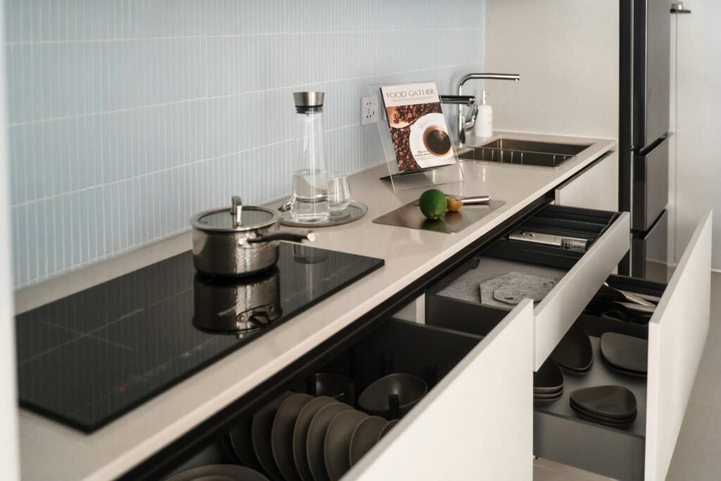
The most under-discussed aspect of kitchen layout is what happens inside the cabinets — and this image makes the case for thinking about it as seriously as any other layout decision. Deep drawers with plates stored vertically rather than stacked: you can see every plate, retrieve any plate without lifting a stack, and the drawer closes cleanly every time. The drawer beside it shows organized dark dishware in a similar system. The whole lower cabinet run functions as a series of accessible, well-organized zones rather than dark cabinets where things hide.
This is the contemporary drawer-heavy kitchen, and it represents a genuine shift from the traditional cabinet-with-doors approach. A pull-out drawer is almost always more accessible than a standard cabinet — you see everything at once rather than having to move items at the front to reach items at the back. The transition from standard base cabinets to deep drawer stacks ($200–600 extra per unit in a renovation, depending on the manufacturer) is one of the highest-return changes available in a kitchen.
The induction cooktop here — flush with the countertop, no raised burner grates — is the other detail worth noting. An induction surface is faster than gas (water boils in roughly half the time), more energy-efficient, easier to clean (spills don’t bake onto burner grates because the surface stays cooler), and produces no combustion byproducts. The counter space adjacent to it can be used immediately after cooking because the surface cools quickly. The objection is usually tactile — gas cooking has a visibility and responsiveness that experienced cooks are attached to — but for the majority of home cooks, induction performs better in practice.
The blue-gray vertical tile backsplash: vertical tile orientation on a wall makes a kitchen feel taller and more contemporary than the same tile laid horizontally. It’s a small decision with a real visual effect.
The L-Shaped Kitchen — The Most Forgiving Layout There Is
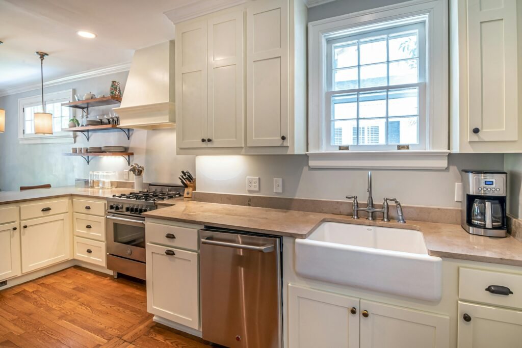
The L-shaped layout — cabinets and counters along two adjacent walls forming an L — is the most adaptable kitchen layout in existence. It works in small kitchens and large ones, in open-plan spaces and closed rooms, in farmhouse styles and modern ones. It doesn’t maximize counter space or storage the way a U-shape does, and it doesn’t create the social center that an island does, but it almost never fails. The work triangle — the path between sink, stove, and refrigerator — is naturally efficient in an L-shape because those three zones fall along two connected runs rather than scattered across a room.
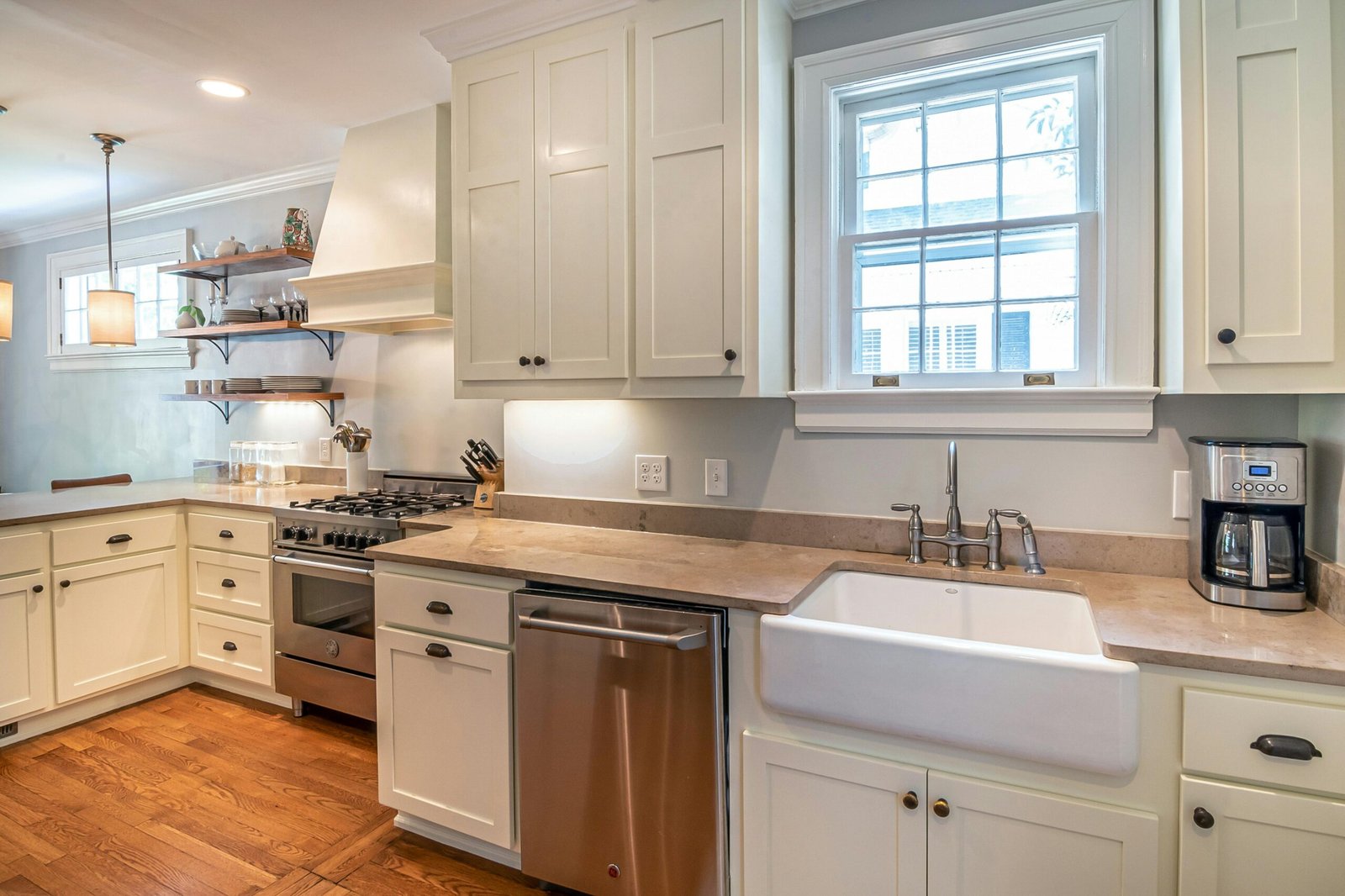
This L-shaped kitchen is a particularly good example of the layout done with character. White shaker cabinets — the style that has been declared dead approximately four times in the last decade and continues to look right in traditional and transitional kitchens — with black hardware rather than the more expected brushed nickel. The farmhouse apron sink under the window: a detail that has its own visual logic (the wide basin is practical for large pots; the apron front that extends to cabinet-toe-kick level looks architectural rather than just functional). Open wood shelves flanking the range hood rather than upper cabinets in that zone — which gives the kitchen breathing room and a more relaxed quality than wall-to-wall uppers would.
The L-shape here opens on both sides, which keeps the kitchen connected to the rest of the house while keeping the work zone defined. This is the right choice for a kitchen that needs to feel integrated into a family home rather than a separate room where cooking happens in isolation.
The practical advice on L-shaped kitchens: the corner junction where the two runs meet is where the layout either shines or fails. A standard corner cabinet — the one where things go to disappear permanently — wastes significant storage. A lazy Susan ($150–300), a pull-out corner drawer system ($400–700), or a magic corner unit that extends outward when opened ($600–1,000) makes that corner usable. Don’t design an L-shaped kitchen without planning the corner solution specifically.
The Open Plan Kitchen — Where the Kitchen Becomes Part of Life
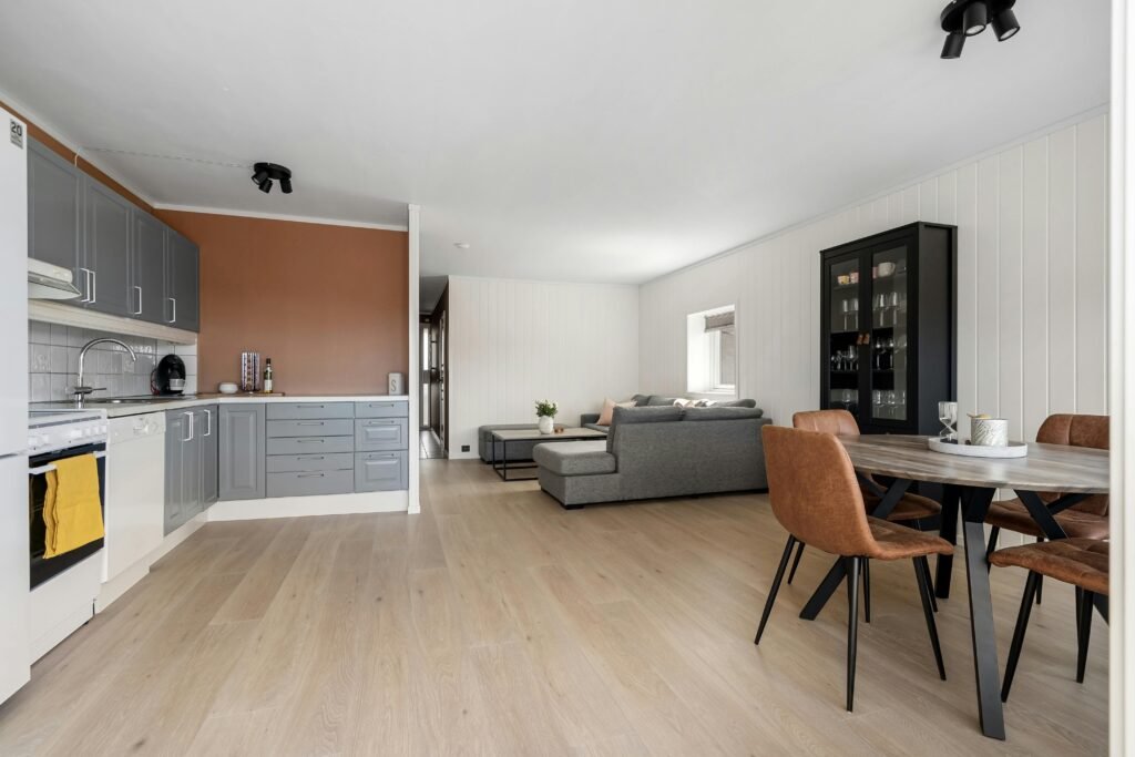
The open plan kitchen — where the kitchen shares space with the living and dining areas rather than occupying a room of its own — changed how homes feel to live in more than any other architectural shift of the last thirty years. This kitchen demonstrates exactly why: you can see the living room sofa from the stove, the dining table from the sink. Whoever is cooking is not separated from whoever is living.
This particular open plan uses the L-shaped layout to keep the kitchen zone clear — the gray shaker cabinets form two walls of the L, and the kitchen simply stops, with no wall or partition separating it from the living and dining areas. The terracotta accent wall behind the kitchen adds color and definition without creating a visual barrier. The light wood floors run continuously through all three zones, which is the decision that makes an open plan feel unified rather than like three separate rooms that happen to share a floor.
The design challenge in an open plan kitchen is that the kitchen is always visible, which means it’s always doing visual work whether or not anyone is cooking. A closed kitchen can be a functional mess — the door hides it. An open kitchen cannot. The storage has to work properly (nothing piled on counters), the appliances have to be worth looking at from the living room (a nice range hood and coherent cabinet color), and the organization has to be maintained as a baseline rather than just before guests arrive.
The practical tradeoff that open plans don’t always acknowledge: cooking smells and sounds travel. Strongly aromatic cooking — onions frying, fish, anything with significant smoke — fills the living room rather than staying in the kitchen. A powerful range hood (at least 600 CFM, ideally more for serious cooking) and a window for cross-ventilation address this; a kitchen that opens entirely with no ventilation doesn’t.
The Small Kitchen Done Right — Open Shelving and Butcher Block
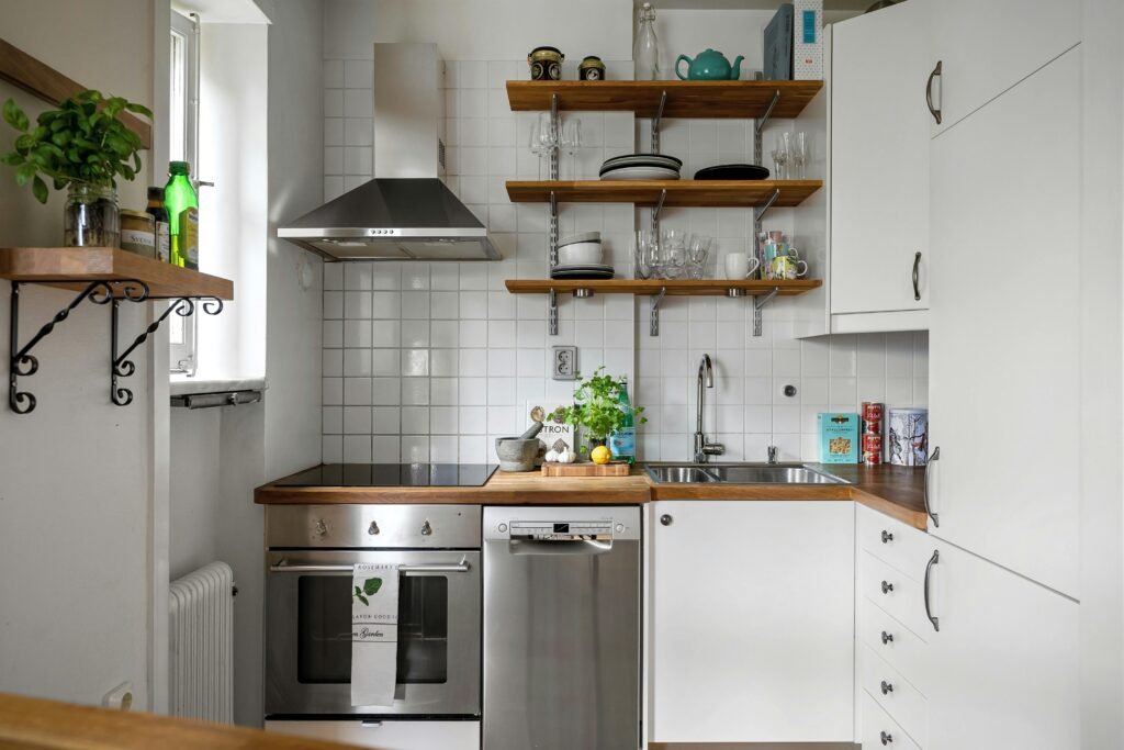
A small kitchen done well is a more enjoyable place to cook than a large kitchen done badly. This compact space — probably under 80 square feet — makes every inch count and does it with warmth rather than austerity. White cabinets keep it from feeling small. Butcher block countertops add warmth and personality that laminate or even stone can’t quite match at this scale. Open shelving instead of upper cabinets on the right wall takes advantage of a storage opportunity while making the kitchen feel more open — closed upper cabinets in a small kitchen can feel like walls closing in; open shelves feel like display and invitation.
The butcher block decision deserves its own honest assessment: it’s beautiful, it’s warm, it’s relatively affordable ($40–100 per linear foot installed versus $80–200 for stone), and it requires maintenance that stone doesn’t. It needs to be oiled regularly (mineral oil, about once a month for new wood, less frequently as it seasons), it will develop knife marks and stains over time that some people love as patina and others find distressing, and it should not be used as a cutting board near the sink long-term because repeated moisture exposure damages it. If you’re willing to care for it, it’s one of the most pleasant kitchen surfaces to work on. If you’re not, stone is more forgiving.
The herbs growing in glass jars on the window shelf: this is the detail that makes a small kitchen feel like it belongs to someone who actually cooks. Fresh herbs within reach — basil, parsley, mint — change how cooking feels and change what’s possible in a meal. A small window shelf at the right height for plants is a small kitchen feature worth prioritizing.
Open shelving reality check: the cookware and dishes on open shelves need to be worth looking at, need to be consistently maintained, and will accumulate dust and grease near the stove. Keep open shelving away from the cooking zone or wipe it regularly. The dishes on the shelves in this kitchen — simple white and clear glass — read as clean and organized. A mix of colors and mismatched objects on open shelves would read as clutter.
The Kitchen Island with Seating — Where the Kitchen Becomes Social
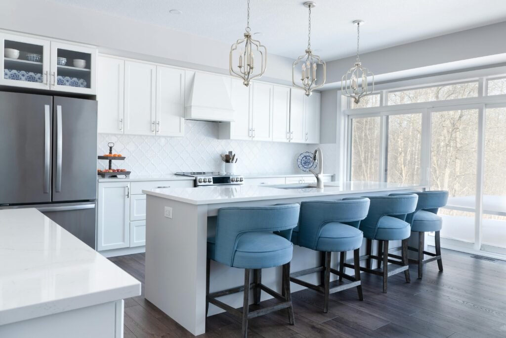
The island with seating is less a layout type than a kitchen feature that changes the room’s social character entirely. An island you can cook at but not sit at is a prep surface. An island with seating on one side is a gathering place — where children do homework while a parent cooks, where guests congregate during a dinner party, where breakfast happens without requiring the full dining table to be set.
This kitchen’s island works at every level. The blue upholstered bar stools — four of them, substantial and comfortable — make the seating side genuinely inviting rather than a perch you’d sit on for a few minutes and then escape. The island is long enough (probably six to seven feet) that the person seated at the far end isn’t in the way of cooking activity. The pendant chandeliers above — in silver/champagne, not black or gold, which would work differently with the white cabinets — hang at the right height: low enough to feel intimate over the island, high enough not to block sightlines.
The arabesque tile backsplash on the perimeter wall — a Moroccan-influenced shape in white with subtle texture — adds pattern to an otherwise all-white kitchen without introducing color. It reads as interesting from across the room and clean up close. The textured white backsplash is a reliable choice for white kitchens that want something beyond the standard subway tile.
Bar stool height: counter-height stools (24–26 inches) for standard counters (36 inches high); bar-height stools (28–30 inches) for kitchen islands raised to 42 inches. Measure your island height before purchasing stools — the wrong height makes the seating uncomfortable regardless of how good the stool looks. Overhang: the island counter needs at least 12 inches of overhang on the seating side for comfortable leg clearance; 15 inches is better.
The U-Shaped Kitchen — Maximum Counter Space, Maximum Storage
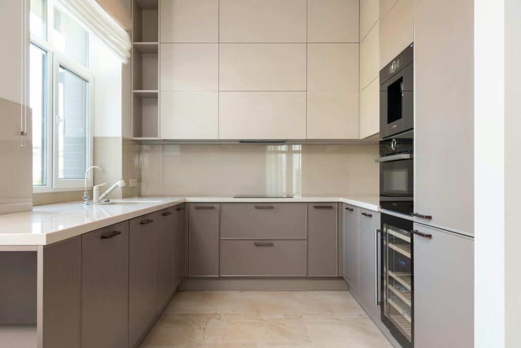
The U-shaped kitchen — three walls of cabinets and counter forming a U — provides more counter space and more storage than any other layout, and it provides something else that’s harder to quantify: the sense of being enclosed in the kitchen, surrounded by your workspace. For a serious home cook who spends significant time at the counter, this enclosure is genuinely pleasant. Everything is within a few steps. The entire perimeter is work surface.
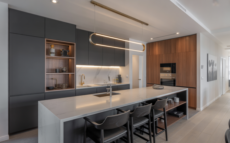
This U-shaped kitchen is the contemporary version done with restraint. Flat-front lower cabinets in a warm greige — not gray, not beige, but the muted warm tone between them — paired with cream/warm white upper cabinets. White quartz counters that read as light and clean. Glass backsplash, which is one continuous easy-clean surface rather than grout-lined tile. Built-in Bosch appliances integrated flush with the cabinet line (the double oven, microwave, and wine cooler stacked on the right wall) rather than freestanding appliances that break the continuous run.
The built-in appliance stack on one wall of the U is the most distinctive feature of this layout — it removes those appliances from the counter entirely, freeing the counter surface for actual cooking. A built-in oven at eye level is easier to check and access than a range oven you have to crouch to see. A built-in microwave at a specific height rather than sitting on the counter recovers counter space that most kitchens desperately need.
The U-shape’s practical limitation: it works best when it’s large enough to allow comfortable movement through the middle. The recommended minimum between two facing counter runs is 42 inches for one cook; 48 inches for two. A U-shaped kitchen in a space that’s too narrow becomes a corridor rather than a cooking zone, and the abundance of storage becomes irrelevant because moving around in it is uncomfortable.
The Builder Standard Kitchen — What You’re Starting With
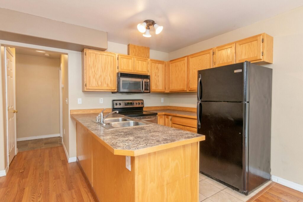
This is the kitchen that most people actually have — the builder-standard layout that came with the house, often with honey oak cabinets that were already dated at installation, laminate countertops, a peninsula that was added to create an approximation of island functionality, and lighting that serves the minimum requirement of making things visible.
It’s worth understanding this kitchen not to dismiss it but to diagnose it accurately, because the changes that make the most difference here are often not the expensive ones. The honey oak cabinets: paint is the transformation that costs the least for the visual change it produces. A high-quality cabinet paint (Benjamin Moore Advance or Sherwin-Williams Emerald Urethane, $60–80 a gallon) in a white, warm gray, or navy, applied properly, changes the entire character of the kitchen. New hardware — different pulls in a contemporary finish — costs $100–300 for a full kitchen and finishes the change.
The peninsula with sink: this is a functional setup that the layout is actually using well. The sink faces out into the room rather than into a wall, which means whoever is washing dishes can see into the living space. That’s a better position than a sink facing a blank wall, and it’s worth keeping rather than assuming the peninsula needs to go.
The overhead flush fixture: this is the lighting change that makes the most immediate difference. Under-cabinet lighting ($100–300 in LED strip lights, hardwired or plug-in) illuminates the actual work surface where the overhead fixture doesn’t reach. A new pendant or two where the flush fixture is ($80–200 each) changes the visual tone of the room. These two lighting changes can cost under $500 total and transform how the kitchen feels without touching a cabinet.
The honest point this kitchen makes: most kitchens don’t need to be gutted. They need to be diagnosed — what specifically isn’t working, and what’s the targeted fix — rather than replaced wholesale.
The Compact U-Shaped Kitchen with Wood and Light
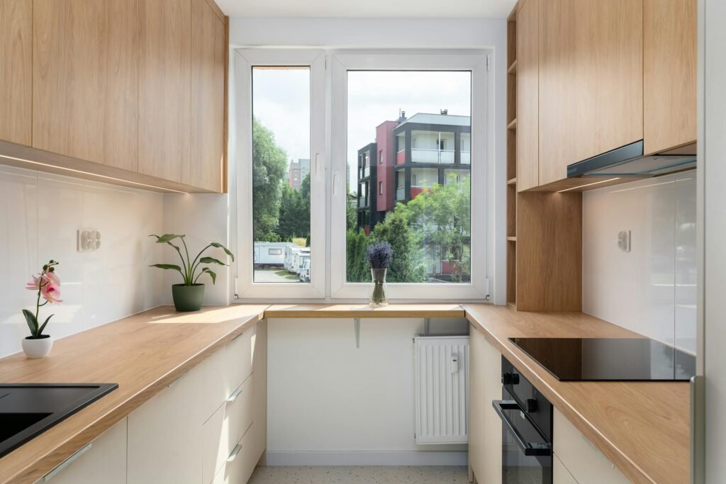
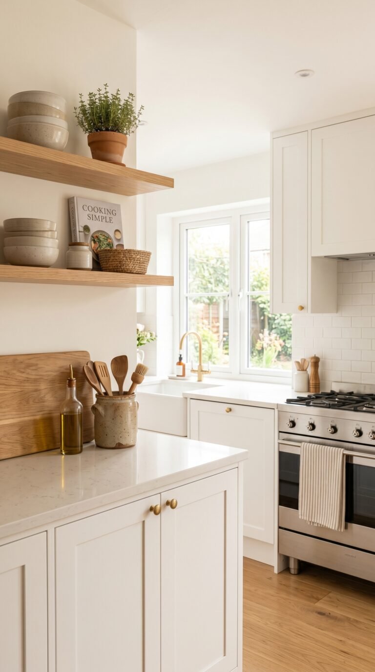
This kitchen is doing something unusual and worth studying: it wraps the butcher block countertop continuously around all three walls of the U, including the wall beneath the window. That continuous countertop — no interruptions, no seams between different materials — makes the kitchen feel larger than its footprint and more designed than the individual elements would suggest. The eye travels around the room without stopping.
The centered window at the end wall is the layout’s best feature and also its governing challenge. You can’t put a sink under that window in the traditional position (directly under the center of the window) without the window frame interrupting cabinet and counter continuity. This kitchen solves it by putting the countertop beneath the window at a lower height than the standard, with a radiator cover beneath it, and using that window ledge as a display surface. The potted plants there get light; the kitchen gets a view; the compromise is well-negotiated.
The two-tone cabinet treatment — white lower cabinets, light oak upper cabinets — is the warm version of the transitional style. All-white would feel cold in a small space; all-wood would feel heavy. The white lower cabinets recede visually, making the floor seem to extend further; the wood upper cabinets bring warmth at eye level where you spend most of your visual attention while cooking.
Small kitchen principle this room demonstrates: when a small kitchen has one window, the entire layout should be organized around maximizing what that window does. Natural light in a small kitchen is not a decorative element — it’s the difference between the kitchen feeling tight and feeling generous. Clear sightlines to the window from the cooking position, no tall cabinets or appliances blocking the path of light into the room.
The Kitchen-Dining Zone — One Room, Two Functions
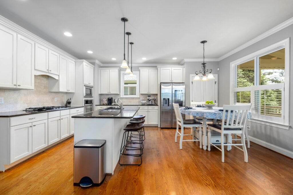
The kitchen-dining zone — where the kitchen and dining table exist in a single open room rather than in adjacent rooms separated by a wall or doorway — is the layout that makes the most sense for how families actually use kitchens. The table visible in this room is not in a separate dining room; it’s in the kitchen, about fifteen feet from the island, under its own pendant light. You can set the table from the island without leaving the room. You can call everyone to dinner without raising your voice.
The layout here handles this by using the island as the soft dividing line between the kitchen zone and the dining zone. The island faces the dining table rather than facing a wall, which means whoever is working at the island is facing the same direction as the dining table — they’re oriented toward the meal and the people who will eat it, rather than turned away from them. This spatial relationship, which sounds small, changes how cooking feels.
The matching lighting approach — pendants over the island, a chandelier-style pendant over the dining table — unifies the two zones visually without making them identical. Different fixture styles, same mounting height, warm tone in both. The hardwood floors running through both zones without transition do the same work horizontally that the continuous ceiling does vertically: they signal that this is one room with two functions rather than two rooms that happen to be adjacent.
The specific challenge in a kitchen-dining zone: acoustics. A hard-surface room — tile or hardwood floors, no rugs, no upholstered surfaces — with an open ceiling produces significant sound reverberation. A rug under the dining table ($150–400 for a good 8×10) absorbs sound, defines the dining zone, and makes the space feel more intimate at dinner. It’s one of the most impactful and least expensive additions to this type of room.
The Questions That Actually Help You Decide
What’s the best kitchen layout for a small kitchen? The galley layout (single wall or two parallel walls) is the most space-efficient for cooking because the work triangle is compressed — everything is within a short reach. The L-shaped layout is the most versatile for small kitchens that need to connect to a living or dining area. The U-shaped layout maximizes storage in a small space but requires adequate width (at least 8 feet between facing walls) to remain comfortable.
Should I remove a wall to open the kitchen? Maybe. The question is whether the wall is load-bearing (which makes removal expensive and complicated), whether the kitchen is oriented correctly for an open plan (it should face a room you want to connect it to, not a utility or storage area), and whether your cooking habits suit an open kitchen (see the note about smells and sounds in the open plan section above). A structural engineer can tell you about load-bearing for $300–500; that consultation is worth doing before you fall in love with the idea.
How big should a kitchen island be? The island should be large enough to be useful (at least 2 feet by 4 feet for a basic prep island) and small enough to allow 42–48 inches of clearance on all sides. A too-small island looks like an afterthought. A too-large island traps people in corridors. The right size is the largest that the clearances allow.
What’s the single most important layout decision in a kitchen? Sink placement. The sink is used more frequently than any other fixture in the kitchen — more than the stove, more than the refrigerator. A sink in the right position (facing into the room, near the dishwasher, with counter space on both sides) makes kitchen work more pleasant every single day. A sink in the wrong position is an inconvenience that compounds over thousands of meals.
The Kitchen You’ll Cook In Every Day
Every one of these kitchens — the luxury island room, the compact Scandinavian U-shape, the farmhouse L, the builder standard that needs paint and lighting — has something worth stealing. Not because any of them is the right answer, but because kitchen design is a problem of specific constraints: the dimensions of the room, the number of people who cook, the style of cooking that actually happens, and the relationship between the kitchen and the rest of the house.
The layout question comes first because it determines the answers to every question that follows. Once you know your layout, the cabinets and the countertops and the backsplash fall into place around it. Get the layout right, and the rest of the decisions get easier. Get it wrong, and no amount of beautiful tile will fix the feeling that the kitchen doesn’t quite work.
Start with how you actually cook, and let the layout follow from that.
What layout does your current kitchen have, and what’s the one thing you’d change? Drop it in the comments — the specifics are always the most useful part.
— Emily